

10 Bold Color Outfits to Copy Today, Plus Size & Custom Fit
Pick one clear palette, cap it at two or three colors, and anchor at least one piece in a neutral or a simple silhouette. That single rule solves most bold-color mistakes before they happen. Match your saturation levels, let one hero piece lead, and build out from there with formulas you can actually copy.
TL;DR:
- Matching saturation levels is crucial, as vibrant colors should be paired with other high-saturation shades, and muted tones with similar muted hues for harmony.
- Colour-blocking should be built on clear principles like complementary, analogous, or triadic schemes, with a neutral or supporting piece to balance the look.
- Custom-made, made-to-order clothing ensures exact fit, precise color placement, and saturation, especially important for plus-size or tailored bold color outfits.
- Fabrics influence color appearance, with matte finishes providing richness and satin or silk offering brightness, affecting how bold colors read under different lighting.
- For various occasions, limit bold colors to one hero piece or accessories, with structured silhouettes for work, textured layers for parties, and careful dress code consideration for weddings.
Table of Contents
- Bold Color Outfits 101: Quick Rules and Palette Choices
- 10 Outfit Formulas You Can Copy Today
- Bold Color Outfits for Every Occasion
- Styling Details: Accessories, Layering, and Color Placement
- Why Fit and Fabric Change Everything About Bold Color
- Fabric and Texture Choices That Make Bold Color Pop
- Seasonal Considerations for Wearing Bold Colors
- Balancing Bold Colors With Patterns and Prints
- The Case for Color-Blocking as the Default, Not the Exception
- Get Your Bold Color Look Made to Order
- Sources
- FAQ
Bold Color Outfits 101: Quick Rules and Palette Choices
Bold color dressing runs on a handful of pairing rules borrowed straight from the color wheel, and once you know them, guesswork disappears. Complementary colors sit across from each other, like red and green or purple and yellow, and they create the highest-contrast, most eye-catching combinations. Analogous colors sit next to each other, like orange and pink or blue and teal, and they read as cohesive rather than clashing. Triadic combinations use three colors evenly spaced on the wheel, like red, yellow, and blue, and they take more confidence but deliver serious visual punch when done right.
Saturation matching matters just as much as hue. Pair vibrant, high-saturation pieces with other vibrant pieces, and pair muted or pastel tones with other muted tones. A neon orange top next to a dusty rose skirt fights itself; a neon orange top next to a hot pink skirt sings, because both colors share similar vibrancy. This is the fastest fix for outfits that feel “off” without an obvious reason.
Neutrals do the quiet work of holding a bold outfit together. Black, white, denim, camel, and beige all act as visual rest stops between colors, which is why so many color-blocked looks include at least one neutral shoe, bag, or outerwear piece. Trend forecasters point to colour-blocking as one of the defining looks moving through 2026, built on the same core principles: offset bright pairings with neutrals, lean into complementary shades, and let one piece act as the hero. Red and purple, in particular, have real momentum right now, showing up together on runways and in celebrity styling as a fresher alternative to the expected red-and-pink combo.
A few working combinations to start with:
- Complementary: cobalt blue with burnt orange, or emerald green with deep red.
- Analogous: fuchsia with tangerine, or teal with cobalt.
- Triadic: mustard yellow, royal blue, and crimson red worn in roughly equal parts.
- Trend-forward: red and purple, styled with one black or white anchor piece.
Pro Tip: If you’re unsure whether two brights actually match, hold both items under the same light and squint. If one looks noticeably duller or brighter than the other, swap it for a closer saturation match.
10 Outfit Formulas You Can Copy Today
You don’t need a styling degree to wear bold color well. You need a formula, a mirror, and permission to commit. Here are ten that work across body types and budgets.
- Mono-color suit, neutral shoe. A single saturated color from blazer to trouser, finished with a white sneaker or nude heel. The one-color approach removes matching guesswork entirely.
- Bright trousers, white tee, matching bag. Wide-leg trousers in cobalt or emerald, a plain white top, and a bag that echoes the trouser color. Works for lunch dates and casual Fridays alike.
- Bright blazer, denim, neutral boot. A fuchsia or orange blazer over straight denim, grounded by a tan or black boot. This formula tames the boldest jacket colors instantly.
- Color-blocked two-piece. A top and bottom in complementary colors, like mustard and violet, styled as a matching set for a polished, intentional look.
- Accessory-only entry point. Neutral head-to-toe outfit, then one bold bag, belt, or pair of shoes. Stylists consistently recommend starting with accessories before committing to full-color looks, and this formula is the lowest-risk way to test a color you’re unsure about.
- Bright dress, neutral outerwear. A statement-color dress under a black or camel coat, so the color reveals itself in flashes rather than all at once.
- Analogous knit set. A sweater and skirt in neighboring hues, like coral and orange, for a look that feels rich without any real contrast risk.
- Denim base, triadic top. Classic blue jeans paired with a top that mixes three colors in one print or panel design, keeping the rest of the outfit quiet.
- Faux fur statement layer. A bold-color faux fur jacket or vest over an otherwise neutral outfit. This works especially well for evening events where texture needs to do as much work as color.
- Plus-size color-block dress. A fitted, structured dress that uses color panels strategically placed at the waist and shoulders to define shape while still delivering full color impact.
For plus-size dressing specifically, formulas 4, 6, and 10 tend to perform best because structured seams and intentional panel placement do more shaping work than a single flat block of color. Custom pieces solve the fit problem these formulas depend on, since a color-blocked dress only looks intentional when the panels land exactly where designed.
Bold Color Outfits for Every Occasion
The same color rules shift depending on where you’re headed, and knowing when to turn the volume up or down is half the skill.
Casual and day looks work best built around one hero piece, like a bright midi skirt or colorful jacket, paired with denim or a neutral base. Save the second color for a bag or sunglasses so the outfit stays easy to move through errands or a lunch date in.
Work settings call for restraint without losing personality. A structured, color-blocked blazer over black trousers reads as sharp rather than loud, especially when the palette stays to two colors and hemlines stay conservative. Save the triadic combinations for outside the office.
Party and concert nights are where texture gets to join the conversation. Metallics, sequins, and faux fur all amplify bold color under low light, and this is the one setting where a full head-to-toe color-blocked look, rather than a single hero piece, feels appropriate. A made-to-order dress in a saturated shade gives you exact color control that off-the-rack rarely offers.
Weddings and special occasions demand a bit more etiquette. Bold color is welcome as a guest, but skip anything that could visually compete with the bridal party’s palette, and check the dress code before committing to a full color-block moment. A coordinated two-piece set or a tailored statement dress from the made-to-order apparel collection lets you show up polished without guessing at sizing. For readers who need something fast, the ready-to-ship collection covers last-minute invitations without sacrificing color impact.
A few quick occasion notes worth keeping in mind:
- Day looks: one hero piece, one neutral base, accessories carry the second color.
- Work looks: two colors maximum, structured silhouette, conservative hemline.
- Party looks: texture plus color, metallics and faux fur both amplify the effect.
- Wedding guest looks: check the dress code, avoid competing with the bridal palette, prioritize fit over statement size.
Styling Details: Accessories, Layering, and Color Placement
Accessories remain the lowest-risk way into bold color, which is why stylists consistently point beginners toward a bag, a pair of shoes, or a belt before a full garment. Building confidence through smaller pieces lets you learn which shades actually work against your skin tone and wardrobe before you invest in something bigger.
Where you place color changes how your body reads. Vibrant shades draw the eye, and muted tones recede, so placing a bright color intentionally can shift perceived proportions. A bold top pulls attention upward toward the face, a bold bottom with a high waistline can visually lengthen the legs, and a color-blocked panel at the waist can define a shape that a single flat color would flatten out.
Mixing prints with solid brights is simpler than it looks if you follow one rule: pull the dominant color out of the print and echo it in a solid piece elsewhere in the outfit. A floral skirt with a strong orange base pairs cleanly with a solid orange top, because the eye reads the two pieces as intentional rather than accidental.
Layering order matters too:
- Foundation: a neutral base layer, like a white tee or black tank.
- Support: a supporting color piece, like a colored cardigan or trouser.
- Hero: one standout piece, like a bold coat, dress, or bag, layered last.
Statement accessories from a curated accessories edit or bold, art-inspired pieces from Fly Miami’s statement collection both work well as that finishing hero layer.
Pro Tip: When in doubt about placement, put your boldest color at the point on your body you most want noticed first, whether that’s your face, your waist, or your shoes.
Why Fit and Fabric Change Everything About Bold Color
Latoya has covered bold, statement-driven style extensively for Primadonsanddonnas, including deeper dives into statement outfit categories and occasion-based styling.
Off-the-rack bold color often fails for one of three reasons: the shade isn’t quite right, the fit doesn’t match the body, or the plus-size version of a bright piece got watered down in both color saturation and cut. Made-to-order solves all three at once. Custom sizing means a color-blocked dress hits at the correct waistline instead of an approximate one, and made-to-order dye or fabric selection means the exact red or purple you pictured is the one that arrives.
Fabric and Texture Choices That Make Bold Color Pop
Fabric changes how a color reads just as much as the shade itself. Matte fabrics like cotton twill or ponte knit absorb light and make bold colors look rich and grounded, which works well for daytime and office settings. Satin, silk, and other high-shine fabrics reflect light and make the same color look brighter and more dramatic, ideal for evening or party wear where you want a color to catch attention under artificial lighting.
Texture adds a second layer of interest without adding a second color. A bold-color faux fur piece brings dimension and warmth to an outfit while keeping the palette simple, which is part of why sustainable faux fur has become a popular way to add a statement layer without reaching for another print or shade. Ribbed knits, sequins, and structured tailoring each shift how saturated a color appears, often making it look deeper or more intense than the same shade in a flat weave.
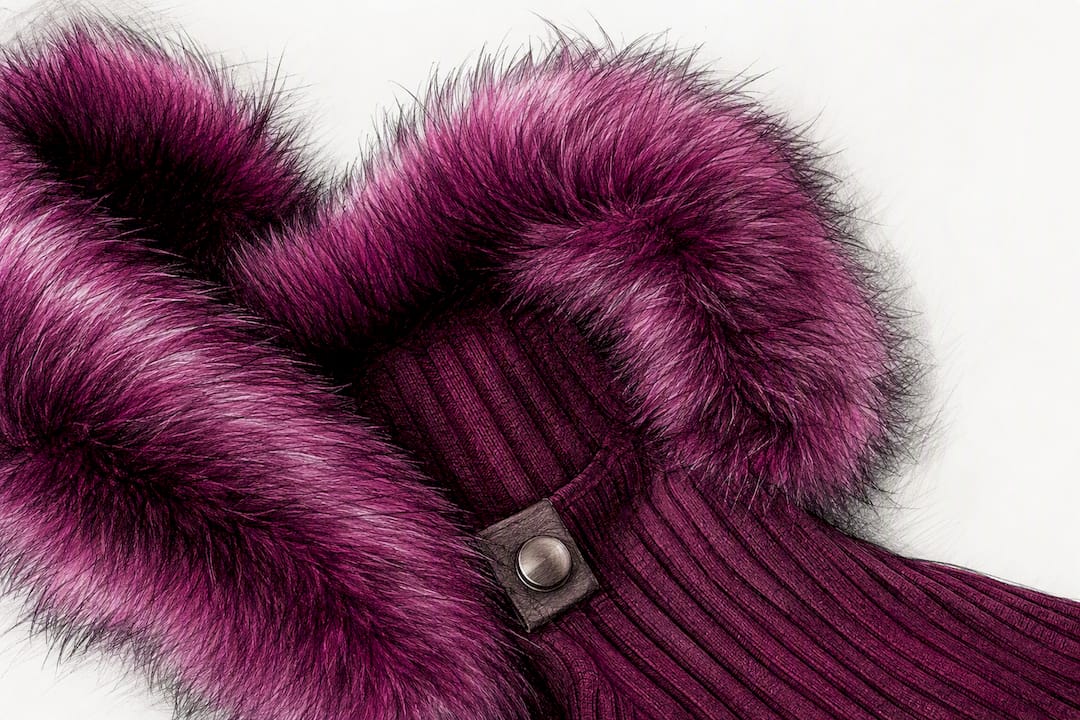
Sheer and lightweight fabrics tend to soften bold color, letting it feel less overwhelming for readers easing into brighter dressing. Heavier structured fabrics, on the other hand, hold a color-blocked seam or panel exactly where it’s designed to sit, which matters most in tailored pieces where the color placement is doing shaping work. When you’re choosing fabric for a bold-color piece, match the finish to the mood you want: matte for polished restraint, shine for maximum impact, texture for warmth and depth.
Seasonal Considerations for Wearing Bold Colors
Bold color doesn’t belong exclusively to summer, even though that’s when most people reach for it first. Each season simply calls for a different fabric weight and a different supporting palette.
Spring and summer favor lightweight cottons, linens, and crepe in bold shades, often paired with white or tan neutrals that read fresh rather than heavy. This is the easiest season to experiment in, since bright colors against sun-warmed skin tones tend to look effortless.
Fall and winter call for richer, deeper saturations rather than the same neon brights from summer. Jewel tones like emerald, sapphire, and deep magenta hold up beautifully against wool coats, knit sweaters, and faux fur trims, and they photograph just as boldly in low winter light as neon does in summer sun. A bold-color coat is one of the simplest ways to carry color-blocking principles into cold weather without needing to layer multiple bright pieces underneath.
Transitional seasons are where layering order becomes most useful. A neutral base layer, a supporting color knit, and a bold outer layer let you adjust for temperature swings while keeping the color story intact from morning to evening.
Balancing Bold Colors With Patterns and Prints
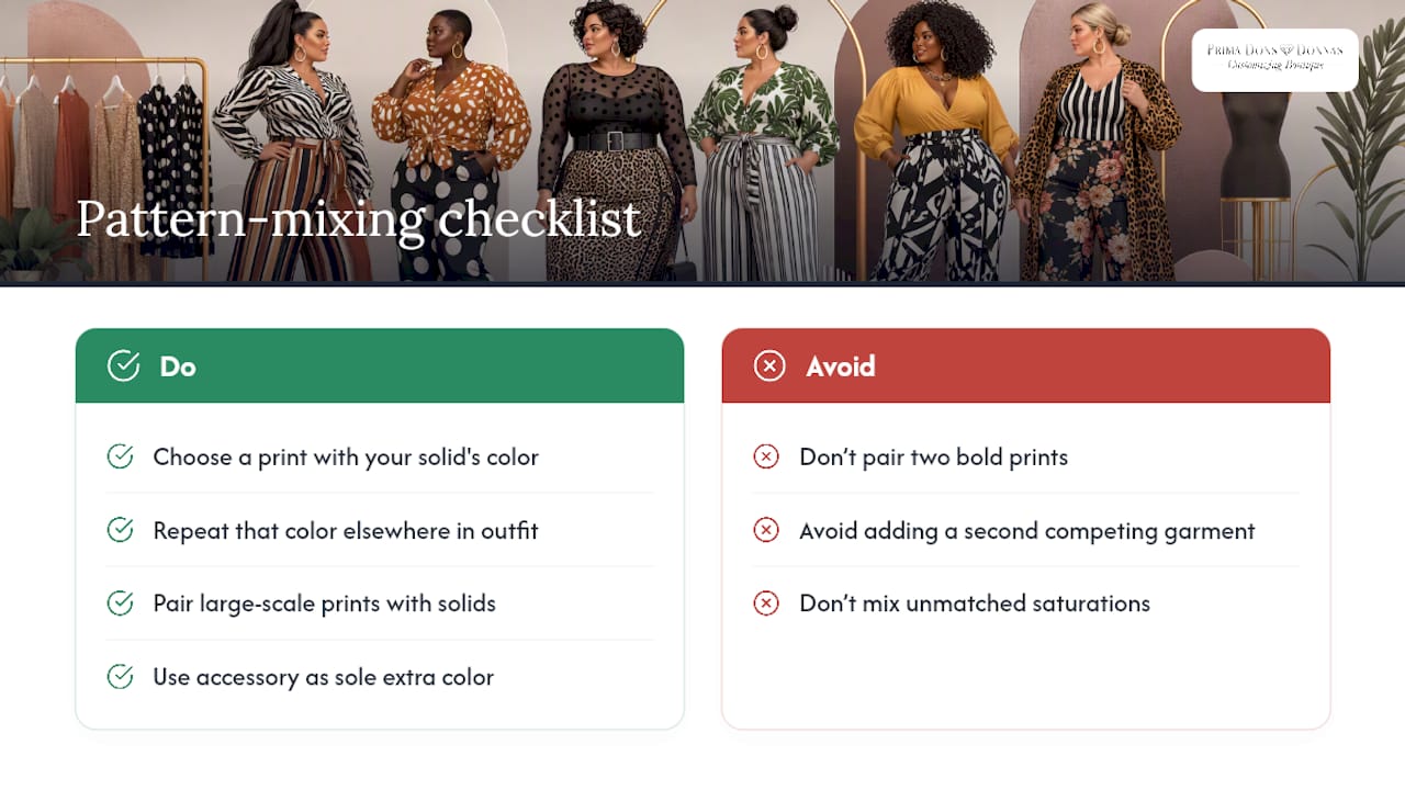
Mixing a bold solid with a bold print intimidates a lot of people, but the rule is simpler than it looks: pick a print that already contains your solid color as one of its dominant tones, then repeat that color elsewhere in the outfit. A striped top in orange and white pairs cleanly with solid orange trousers, because the eye recognizes the repetition instead of reading it as two competing decisions.
Scale also matters. A large-scale print, like a bold floral or geometric pattern, needs a solid partner rather than a second print, at least until you’re confident mixing multiple patterns at once. A smaller-scale print, like a fine polka dot or thin stripe, has more room to sit next to a second subtle pattern without overwhelming the outfit.
Keep one pattern as the star of the outfit and let other pieces act as support. A checklist approach of starting with a neutral base, matching saturation, and limiting your total color count applies just as well to pattern mixing as it does to solid color-blocking. When in doubt, let a single accessory, like a bold bag or shoe, be the only “extra” color in a print-heavy outfit rather than adding a second full garment in a competing shade.
The Case for Color-Blocking as the Default, Not the Exception
Bold color has spent the last few seasons pushing back against the beige, minimalist dressing that dominated for years, and that shift matters more than most style advice admits. Colorful dressing has become an emotional countertrend as much as a visual one, and simple silhouettes are what keep it from tipping into costume territory.
Where conventional advice falls short is treating bold color as an occasional statement rather than a default choice. The 2026 color-blocking trend rewards people who wear color often enough to develop real instincts about saturation and placement, not people who save it for one event a year. Plus-size dressing gets shortchanged here too. Most bold-color guidance assumes a standard size range, when panel placement and saturation matching actually matter more, not less, on a fuller figure, because ill-fitted color blocking distorts proportion instead of flattering it.
Prioritize fit before you prioritize trend. A perfectly saturated color-block dress in the wrong size will always underperform a simpler, well-fitted piece in the same shade. Get the fit right first, then chase the boldest palette you want.
— Latoya
Get Your Bold Color Look Made to Order
Off-the-rack bold color rarely comes in the exact shade, size, or fit you actually pictured, which is the gap Primadonsanddonnas was built to close. Every piece in the made-to-order apparel collection can be built in the color, size, and silhouette you want, including full plus-size options that treat panel placement and saturation as seriously as the color itself.
If your event is closer than your custom timeline allows, the ready-to-ship collection covers bold-color looks you can order and wear within days, and Express Shipping is available as an add-on for tighter deadlines. Whether you’re building a color-blocked wedding-guest look or a custom-fit party dress in your preferred shade, start by browsing a made-to-order collection and place your order with your color and size specifications.
Sources
- 7 Colour-Blocking Trend Rules That Will Be Everywhere in 2026 | Who What Wear
- What is colorblocking in fashion? (InStyle)
- Red-and-purple color combination trend (Marie Claire)
FAQ
What Are Bold Colors in Fashion?
Bold colors are high-saturation, high-visibility shades like cobalt, fuchsia, emerald, and crimson that stand out against neutral tones and draw immediate attention when worn as a hero piece or in a color-blocked combination.
What Makes a Woman Look Wealthy in Bold Color?
Simple silhouettes, well-fitted tailoring, and a limited color palette read as intentional and polished, which is why stylists pair bold shades with clean cuts rather than busy patterns or ill-fitting pieces. Custom, made-to-order fit from a specialized source removes the guesswork of finding that exact polished shape.
What Is a Bold Outfit?
A bold outfit uses one or two saturated, high-contrast colors, often through color-blocking or a single statement piece, balanced with a neutral element like black, white, or denim to keep the look wearable rather than costume-like.
How Do You Wear Bold Colors Without Overdoing It?
Limit yourself to two or three colors, match your saturation levels so brights pair with brights, and start with accessories if you’re not ready to commit to a full bold-color garment.
Does Primadonsanddonnas Offer Custom Bold Color Options?
Made-to-order apparel collections let you specify colors and sizing, including plus-size fits, for dresses, outerwear, and separates built around your preferred bold palette.


Leave a comment