

10 Runway Informed Color Blocking Outfits That Actually Fit Plus Sizes
Color blocking means pairing solid, contrasting colors in one outfit for a bold, graphic effect. The fastest way in: pick one hero piece in a strong color, then match saturation across every supporting piece, brights with brights, pastels with pastels. Add a neutral bag or jacket if the combination feels like too much.
TL;DR:
- Color blocking works best when selecting a hero piece in a bold color, with supporting items matching saturation levels to avoid visual chaos.
- Complementary palettes create high contrast and energy, while analogous and monochrome schemes offer softer, more harmonious looks, depending on the occasion.
- Starting with neutral basics and one bright accent makes experimenting with bold color combinations safer and more approachable for beginners.
- Proper fitting and placing lighter or brighter colors strategically can influence body shape perception by drawing attention or elongating specific areas.
- Keeping the outfit within the three-color limit, matching saturation, and adding neutral layers help prevent oversaturation and maintain a balanced, intentional look.
Table of Contents
- 1. The fundamentals of color blocking
- 2. Color wheel and palette types that work for color blocking
- 3. How to choose palettes: safe starters and bolder combos
- 4. Practical styling techniques to translate palettes into outfits
- 5. Ten outfit ideas to copy for everyday and special occasions
- 6. Five-step checklist to try color blocking today
- 7. Author and brand expertise behind this color-blocking guide
- 8. Seasonal considerations for color blocking
- 9. Considering body shape and proportions in color blocked outfits
- 10. Common mistakes to avoid in color blocking
- 11. A personal note on making color blocking your own
- 12. Prima Dons and Donnas: built for color-block outfits
- Sources
- FAQ
1. The fundamentals of color blocking
Color blocking pairs two or three solid colors in large, clean shapes rather than mixing prints or patterns. The look traces back to mod fashion and the geometric canvases of Piet Mondrian, whose grid paintings turned primary colors into a design language that fashion later borrowed.
Every color-blocked outfit needs a hero piece and supporting pieces. The hero is the color that anchors the look, often the biggest or brightest item, a dress, coat, or jumpsuit. Supporting pieces echo or contrast the hero without competing with it. Color blocking can appear built into a single garment as stitched panels, or it can be built from separates in solid colors worn together, according to InStyle.
How loud the look reads depends on contrast and quantity. Two bold complementary colors across a full outfit make a statement fit for a party or a night out. The same colors used in smaller doses, a colored bag against a neutral dress, read as subtle and work fine for a lunch date or office day.
2. Color wheel and palette types that work for color blocking
Four palette types cover almost every color-blocked outfit worth wearing. Complementary colors sit opposite each other on the color wheel, think royal blue and orange, or fuchsia and green, and they create the highest contrast and energy. Analogous colors sit next to each other, like teal and blue-green, and produce a softer, more harmonious look. Triadic palettes use three colors spaced evenly around the wheel, such as red, yellow, and blue, for a bolder but still balanced combination. Monochrome color blocking uses one hue in different shades, like a lavender top with a deep purple skirt, for a graphic effect without much risk.
Whichever palette you choose, saturation matters more than the specific hue. InStyle notes that matching saturation, brights with brights, pastels with pastels, keeps the look wearable instead of chaotic. A neon top next to a dusty rose skirt fights itself; a neon top next to a cobalt skirt reads intentional.
Undertones are the finishing detail. Vogue points out that personal undertones, cool, warm, or neutral, affect which colors flatter you, and choosing hues that share a tonal family makes a combination look deliberate rather than accidental. A quick undertone check before shopping saves a lot of returns.

3. How to choose palettes: safe starters and bolder combos
Starting simple builds confidence before you commit to a full color-blocked outfit. A neutral base with one bright accent, black pants with a cobalt top, is nearly foolproof. Pastel-on-pastel combinations, like blush and mint, offer the graphic effect with none of the intensity.
Once you’re comfortable, bolder combinations open up:
- Complementary brights: orange and blue, or magenta and green, for maximum contrast.
- Triadic sets: red, yellow, and blue worn in roughly equal blocks for a runway-informed look.
- Tonal monochrome: three shades of the same color, light to dark, for depth without risk.
- Undertone-matched pairs: warm coral with warm mustard, or cool berry with cool navy, checked against your own undertone for the most flattering result.
4. Practical styling techniques to translate palettes into outfits
Separates give you the most control. A colored top paired with a colored skirt or pants lets you swap one piece without redoing the whole outfit, while a matching two-piece set does the color-blocking work for you in a single purchase.
Neutral outerwear is your safety net. Who What Wear reports that 2026 runway coverage shows designers offsetting bold color pairings with neutral coats and jackets, using them as a reset when the underlayers get experimental.
- Start with one colored accessory, a bag or shoes, against a neutral outfit.
- Move to a colored top or bottom paired with neutral separates.
- Try two colored separates together once you trust your eye for saturation.
- Layer a neutral coat over a bold pairing for a toned-down finish.
- Add texture, a ribbed knit or a structured fabric, to keep matching colors from looking flat.
Pro Tip: If a combination feels too loud in the mirror, swap one piece for its neutral counterpart rather than abandoning the palette entirely.
5. Ten outfit ideas to copy for everyday and special occasions
Each of these formulas follows the hero-and-support rule, so you can rebuild them with pieces you already own or shop for the missing piece.
- Lunch date: A custom dress in cobalt with a neutral tan sandal keeps things easy and polished.
- Concert night: Fuchsia top, black bottoms, and a single green accessory for a complementary pop without overdoing it.
- Work day: Mustard blazer over a navy dress, an analogous pairing that reads professional, not costume-like.
- Party event: A monochrome set in three shades of red for a graphic, photo-ready silhouette.
- Plus-size everyday: Emerald top with a rust-orange skirt, sized to fit through custom plus size apparel rather than forced into standard cuts.
- Wedding guest: Soft lavender dress with a deeper plum shoe, a tonal look appropriate for wedding apparel.
- Weekend casual: Denim jacket, cream tee, and a bright orange bag as the only color block.
- Date night: Teal jumpsuit with a single gold accessory for a triadic hint without going overboard.
- Photoshoot: Coral top and turquoise bottoms, checked against your undertone first.
- Suiting: Matching cobalt set with a neutral white shirt underneath for a modern, boardroom-ready block.
6. Five-step checklist to try color blocking today
Getting started takes five steps and about ten minutes with your closet open.
- Pick a hero piece in the color you already reach for most.
- Add one or two supporting colors, no more, following the 3-color rule for a beginner-friendly limit.
- Check that every color matches in saturation, brights with brights.
- Add a neutral reset, a jacket, bag, or shoe, if the pairing feels loud.
- Step back and look for balance between color, proportion, and texture.
The 3-color rule is a guideline, not law. Two colors plus one neutral is the safest version; three true colors works once you trust your saturation-matching instincts. If you’re still hesitant, start with a colored accessory or a single matching set before building a full color-blocked outfit from separates.
7. Author and brand expertise behind this color-blocking guide
This guide was written by Latoya for a made-to-order fashion brand that builds custom clothing and footwear in any size or color. Because every piece is made to order, color-block combinations that are hard to find off the rack, an exact saturation match, a specific undertone, a plus-size cut, become simple requests rather than compromises.
8. Seasonal considerations for color blocking
Color blocking adapts season by season more easily than most trends because the technique is about color placement, not fabric weight. Spring and summer favor lighter, brighter combinations, think citrus orange with sky blue, worn in breathable fabrics like cotton or linen. These months also suit pastel-on-pastel blocking for daytime events, lunch dates, or garden weddings.
Fall and winter call for richer, deeper saturations. Burgundy, forest green, and mustard read as color blocking without feeling out of place against cooler weather, and a custom outerwear piece in a bold neutral, camel or charcoal, can act as the reset layer over a brighter sweater or dress underneath.
Occasion matters as much as season. A concert or party event can handle louder, more saturated combinations than an office day or a lunch date, where a single colored accessory against a neutral outfit reads more appropriate. Holiday gatherings often welcome jewel-toned color blocking, sapphire with emerald, while summer weddings lean toward softer analogous pairings. Matching the intensity of your color choices to the formality and season of the event keeps the outfit from feeling mismatched to the moment.

9. Considering body shape and proportions in color blocked outfits
Color blocking is, at its core, a tool for shaping the eye’s path across your body, which makes proportion just as important as color choice. Placing a brighter or lighter color where you want attention, and a deeper or darker color where you want less focus, works regardless of size or shape.
A common approach pairs a bolder color on top with a deeper, more grounding color on the bottom, which tends to balance the eye evenly. Reversing that, a bold bottom with a quieter top, shifts focus downward and can elongate the look of the legs. Horizontal color blocks at the waist, a colored belt or a fitted panel, can define the middle of an outfit, while vertical blocks, a color-blocked dress with a center seam, tend to read taller.
Fit matters more than the color pairing itself. A boldly colored piece that fits loosely in the wrong places draws attention to fit issues before it shows off the color combination. This is where made-to-order pieces help, because a hero piece cut to your actual measurements lets the color do the work it’s designed to do, rather than fighting a fit that wasn’t built for your body.
10. Common mistakes to avoid in color blocking
The most frequent mistake is mismatched saturation, pairing a neon piece with a muted or dusty version of another color. The fix is simple: keep every colored piece in the outfit at a similar intensity, whether that’s all brights or all pastels.
Another common error is skipping the hero piece and treating every color as equally dominant, which leaves the eye with nowhere to land. Choose one piece to be the star and let the rest support it. Overcrowding the palette is a related problem, four or five competing colors read busy rather than intentional, which is why the 3-color rule works as a practical ceiling for most outfits.
Ignoring proportion is another trap. A color-blocked outfit with no clear top-to-bottom balance, or one that adds bulk exactly where a bold color already draws the eye, fights itself. And skipping the undertone check leads to colors that clash with skin tone even when they work fine on the color wheel. The fix for most of these mistakes is the same: slow down, check saturation and undertone before buying, and use a neutral piece to rescue any combination that starts to feel like too much.
11. A personal note on making color blocking your own
My easiest wins start with a single colored bag against an all-neutral outfit, no risk, all payoff. Rules like the 3-color guideline are a starting point, not a ceiling. Once you know your undertone and how saturation works, bend the rules until the outfit looks like you.
— Latoya
12. Prima Dons and Donnas: built for color-block outfits
Color blocking can be easier when pieces are available in exact colors and saturations your outfit needs, rather than limited stock options. Custom fitting options help ensure a bold hero piece fits well across different sizes rather than fighting your shape.
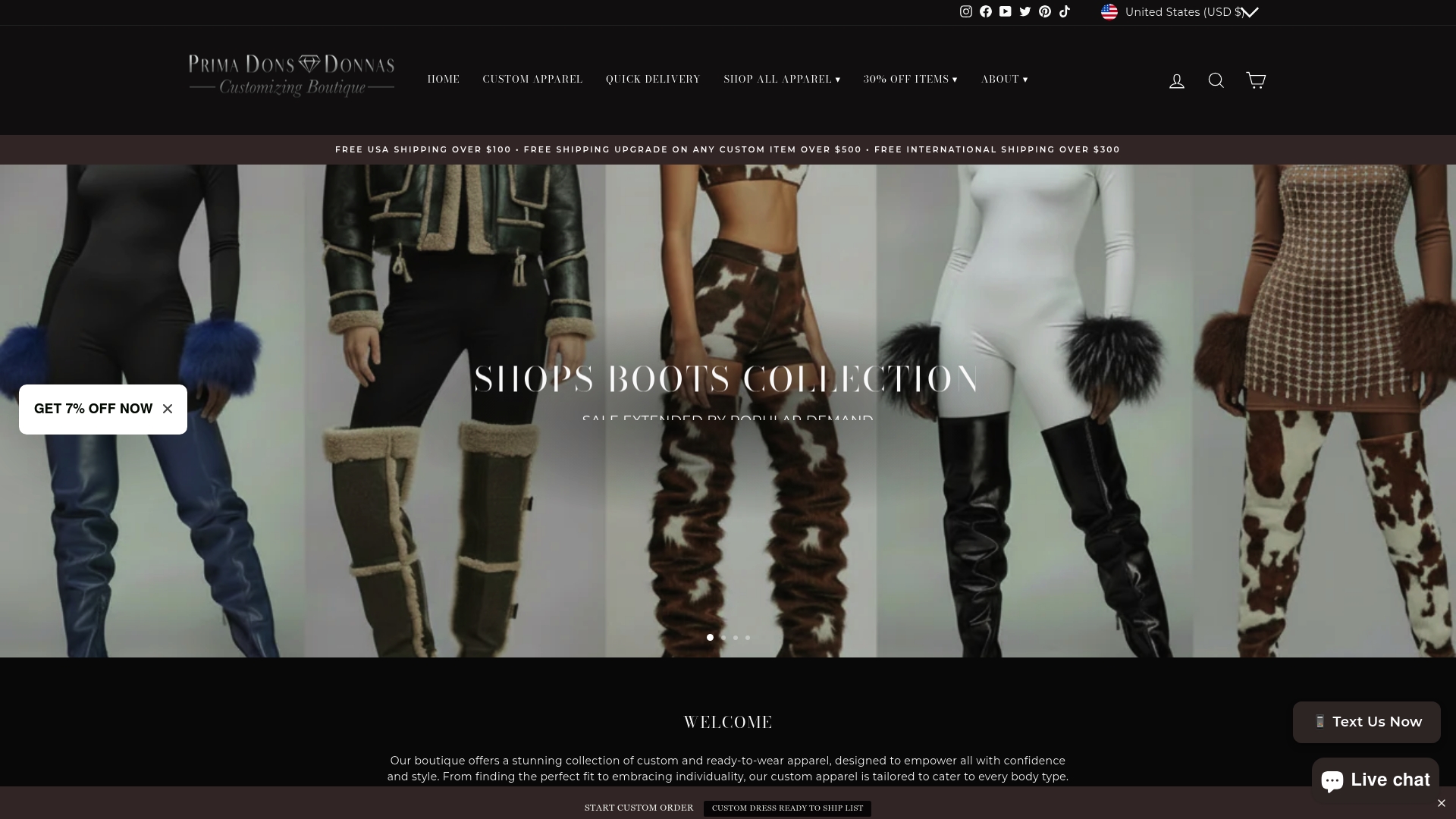
Start with a hero piece from our custom dress collection, pair it with a custom outerwear piece as your neutral reset, or grab a ready to ship set if you want to try color blocking this week. Browse the made-to-order apparel collection to build your outfit in the exact colors this guide recommends.
Sources
- What Is Colorblocking? How to Wear This Timeless Trend — InStyle
- How to master color theory in clothing — Vogue
- 7 Colour-Blocking Trends to Re-Create in 2026 — Who What Wear
FAQ
What is color blocking in clothing?
Color blocking is styling an outfit with two or more solid, contrasting colors placed in clean blocks rather than mixed patterns. It can be built into one garment’s panels or created by pairing separate solid-colored pieces, according to InStyle.
What are the best colors for color blocking?
There’s no single best pairing, but complementary colors, opposites on the color wheel like blue and orange, create the highest contrast, while analogous colors next to each other create a softer look. Matching saturation, brights with brights or pastels with pastels, matters more than the specific hues chosen, per InStyle.
What is the 3 color rule for outfits?
The 3-color rule suggests limiting an outfit to three colors at most, often one hero color plus two supporting colors or one supporting color and a neutral. It’s a practical ceiling for beginners rather than a strict law, and confident dressers can bend it once they understand saturation matching.
What are the rules for color blocking?
The core rules are choosing one hero piece, matching saturation across supporting colors, and using a neutral or accessory to tone down a combination that feels too bold. Personal undertones also help determine which color pairings look intentional rather than accidental, according to Vogue.


Leave a comment