

5–10 Free Swatches: 2026 Custom Color Dress Ideas for Plus Size Fit
Pick your palette type first, physically test the fabric swatch under real light second, and build in reversible personalization third. That sequence beats guessing from a screen every time, because monitor colors lie and swatches don’t. The process can be simplified by using free color swatches and made-to-order construction, helping avoid locking into a shade unseen in the room where it will be worn.
TL;DR:
- Testing fabric swatches under real lighting conditions is crucial, as monitor colors and photos often distort the true shade.
- Reversible accessories like detachable overskirts, sleeves, and piping enable easy color changes for different occasions without full dyeing.
- The success of a custom color depends on understanding hue, value, and intensity, and testing these on the exact fabric before finalizing.
- Color placements should emphasize the areas you want to highlight, using hierarchy, repetition, and proportion to prevent a cluttered look.
- Requesting multiple swatches and photographing them in lighting similar to the event reduces the risk of misjudging the final color outcome.
Table of Contents
- Custom Color Dress Ideas by Mood and Occasion
- How to Choose a Palette for Your Skin Tone and Silhouette
- DIY Personalization Techniques That Change a Dress Without a Full Recolor
- Fabric and Dye Testing: A Protocol That Actually Predicts Your Final Shade
- Design Principles That Keep a Multicolor Dress From Looking Cluttered
- A Practical Take on Getting the Color Right
- Request Swatches and Start Your Custom Color Dress
- Sources
- FAQ
Custom Color Dress Ideas by Mood and Occasion
Color combinations do the emotional heavy lifting before a single sequin gets sewn on. A jewel-tone pairing says something completely different than a pastel one, even on the identical silhouette, and knowing which mood you’re chasing narrows a thousand options down to five or six worth testing.
Here’s a working bank of combos organized by the feeling they create, plus which fabric finish and placement makes each one sing.
Jewel-tone evening:
- Emerald green bodice with deep sapphire trim — sheen finishes like satin or charmeuse catch light best on evening pieces.
- Amethyst purple with garnet red piping along the neckline and hem.
- Sapphire blue paired with a small gold metallic accent at the waist for definition.
Metallic glam:
- Rose gold with champagne undertones works on curve-hugging silhouettes where light needs to move, not sit flat.
- Gunmetal silver against matte black for a party dress that reads modern rather than costume-y.
- Bronze metallic bodice with a matte nude skirt, so the shine stays concentrated where the eye lands first.
High-contrast statement:
- Black and white in bold panel blocks, ideal for concerts or photoshoots where you want the dress to read clearly from a distance.
- Cobalt blue against warm orange, a genuinely striking combination.
- Hot pink with deep charcoal, matte fabric on the dark portion so the pink pops without competing sheen.
Pastel romance:
- Blush pink with sage green accents, best in matte cotton blends or soft crepe for daytime lunch dates.
- Lavender with buttery yellow trim, a soft combination that photographs beautifully outdoors.
- Powder blue paired with a whisper of coral at the waist.
Earthy capsule:
- Olive green with rust orange, one of WhoWhatWear’s standout 2026 color pairings, and one that adapts easily to a wrap dress or a fitted sheath.
- Terracotta with cream, matte linen-look fabric for a relaxed daytime feel.
- Camel with deep forest green trim.
Three more 2026 combinations worth stealing directly from the runway conversation: butter yellow layered with magenta and a grounding chocolate brown, a trio WhoWhatWear calls out as one of the season’s most repeated pairings. On a dress, that translates as a butter yellow body, magenta piping at the bodice, and a chocolate belt or hem trim, so no single color overwhelms the other two. Also, designers are leaning into bold, high-contrast duos that read well on camera, which matters enormously if your dress is headed to a concert, a stage, or a photoshoot where lighting will be unpredictable.
Pro Tip: Sheen fabrics amplify color under stage or flash lighting, while matte fabrics absorb it. If you’re choosing between two finishes for the same shade, pick sheen for nighttime events and matte for daylight photos.
For metallic-specific inspiration, browsing a metallic dress collection shows how the same rose gold or gunmetal tone shifts depending on how much surface area it covers.
How to Choose a Palette for Your Skin Tone and Silhouette
Color has three components that matter more than the color name itself: hue (the actual color family, like blue or red), value (how light or dark it is), and intensity (how saturated or muted it reads). The Museum at FIT’s design framework treats these three as the building blocks of every garment decision, and it’s the reason two “red” dresses can look completely different on the same person.
Colors near your face carry more visual weight than colors lower on the body. A high-value, high-intensity shade at the neckline draws the eye up; a muted, lower-value shade at the hem grounds the look. That’s why bodice color and skirt color rarely need to match exactly.
Here’s a practical checklist for landing on a combination that actually flatters you:
- Pick your dominant, support, and accent colors before you touch fabric. The dominant color covers the most surface area, the support color balances it, and the accent shows up in small doses like piping or trim.
- Test the swatch at face level, not just against your hand. Hold it under your chin in a mirror to see how it interacts with your skin tone and hair color.
- View it under daylight and event lighting. A shade that looks rich under warm bulbs can go flat or muddy under fluorescent or stage lighting.
- Check accessories and lining together. A lining peeking through a slit or sleeve changes the overall color story more than people expect.
Plus-size specifics: the goal is emphasis and wearer confidence, never camouflage. Vertical color panels create length without hiding the body. Controlled repetition, echoing an accent color two or three times across the garment, creates rhythm and unity rather than visual clutter. Placement should highlight the areas you want noticed, whether that’s a defined waist, strong shoulders, or a dramatic neckline, instead of trying to minimize anything.
Pro Tip: Request 5 to 10 swatches in your top color candidates, then photograph each one pinned to a dress form or held against yourself in the lighting you’ll actually wear the dress in. Comparing photos side by side catches problems your eyes miss in the moment.
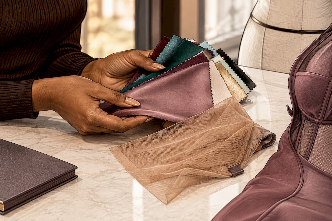
Guidance built specifically around dress color choices for different skin tones and plus-size shoppers walks through this in more depth if you want a second opinion before committing.
DIY Personalization Techniques That Change a Dress Without a Full Recolor
Not every color update requires dyeing the whole garment. Detachable and semi-permanent additions let you shift a dress’s color story for one event and shift it back for the next, which matters if you’re working with a single investment piece rather than a closet full of options.
- Detachable overskirts swap a dress from daytime neutral to evening bold in minutes, and they’re easy to source or commission separately from the base garment.
- Removable sleeves and straps in a contrast color change the neckline story without touching the rest of the dress.
- Belts and sashes are the lowest-effort color swap available. A single olive dress can read three different ways with a rust, gold, or cream sash.
- Piping and trim added along seams or hems introduce an accent color in a controlled, narrow band, exactly the kind of repetition that reads as intentional rather than accidental.
Fabric paint and hand-painting work well for smaller design moments, like a painted floral accent or a geometric panel, but always test on a scrap of the exact fabric first. Paint behaves differently on cotton than on polyester blends, and what looks vibrant on the test swatch can crack or fade unevenly once the garment moves with the body.
Dyeing a finished piece is riskier and should be treated as a last resort rather than a first idea. If you go this route, test dye concentration and timing on a scrap of the same fabric before committing to the full garment. A peer-reviewed textile study found that dye concentration and dyebath pH strongly affect both color strength and how well the color survives washing, which means the exact same dye can produce two different results depending on fiber content and bath conditions.
Rhinestones, embroidery, and appliqué add color in controlled doses rather than blanket coverage. Placement matters here too: cluster embellishments where you want emphasis (a neckline, a waistband) and use sparser, smaller accents elsewhere to keep rhythm without overwhelming the eye.
Pro Tip: Mixed-fiber garments (a poly-cotton blend, for example) often take dye unevenly because each fiber absorbs color differently. When in doubt, choose a panel, appliqué, or detachable piece over dyeing the entire garment. It’s far easier to control and far easier to redo if it doesn’t work.
A closer look at fabric selection for custom apparel covers how different base materials respond to these techniques before you start cutting or painting.
Fabric and Dye Testing: A Protocol That Actually Predicts Your Final Shade
Guessing a final color from a phone photo or a paint chip is the single biggest reason custom color projects disappoint. Here’s the testing sequence that removes most of the guesswork:
- Get a swatch of the exact fabric you’ll use for the finished dress, not a similar one. Fiber content changes how color reads.
- Test dye concentration, pH, temperature, and timing on a scrap before touching the real garment, since these four variables together determine final color strength and fastness.
- Dry and launder the sample swatch the way you’d care for the finished piece. Colors sometimes shift or fade during the first wash, not before it.
- Inspect the washed, dried swatch in daylight and again under event-style lighting. Oregon State’s textile guidance points out that adjacent colors, viewing distance, and fabric sheen all change how a color is perceived, so one lighting check isn’t enough.
Fiber type and dyebath pH matter more than most DIY guides let on. The same red dye can turn brick on cotton and coral on a poly blend, purely from how each fiber absorbs pigment. That’s the core reason a “test on scrap first” rule isn’t optional advice. It’s the difference between a dress that matches your vision and one that needs a redo.
For care, U.S. textile-care regulations require garments to carry regular-care instructions, plus a warning if a normal cleaning method could damage the piece, per federal textile care labeling rules. Practically, that means washing custom-colored pieces with like colors and asking your maker for specific cleaning notes, especially with saturated or hand-dyed shades that are more prone to bleeding.
Before placing any custom color order, request three things: a physical swatch, a colorfastness test result or instructions, and a written recommendation on cleaning.
Design Principles That Keep a Multicolor Dress From Looking Cluttered
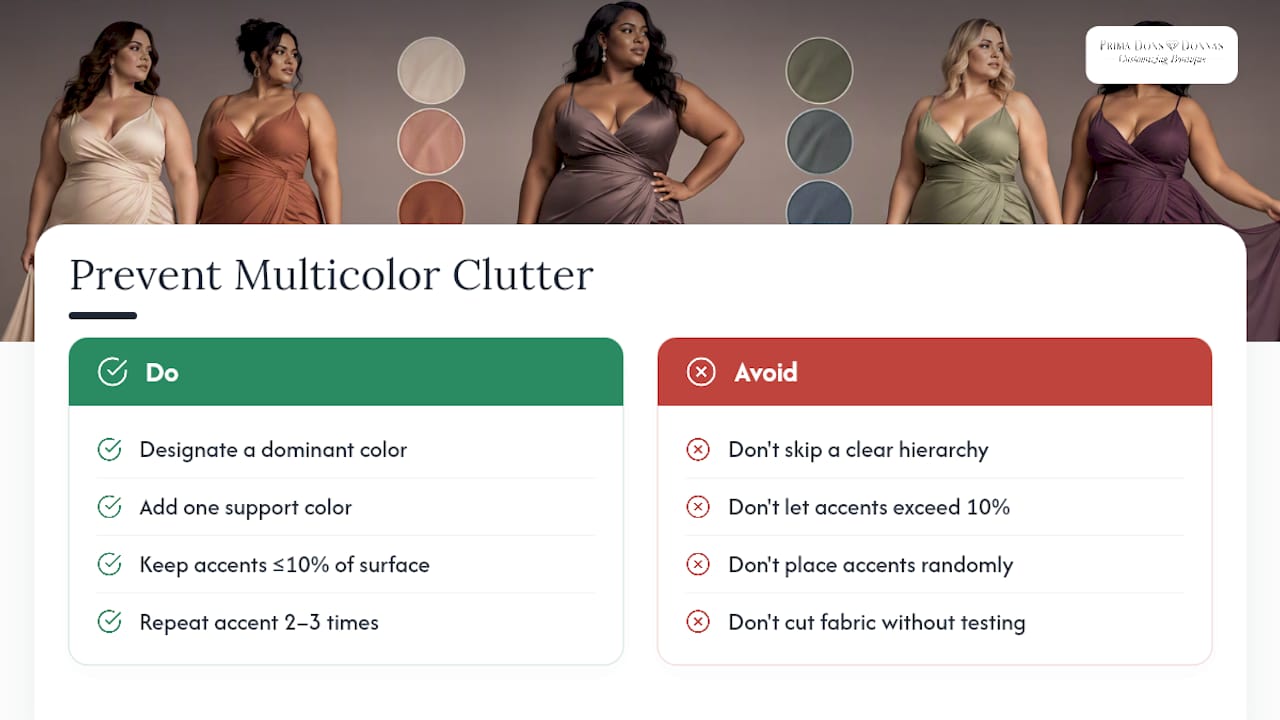
A dress with four colors can look intentional or chaotic, and the difference almost always comes down to hierarchy. Designate one color as dominant (the largest surface area), one as support (a secondary block), and one or two as accents (small, deliberate hits). Skip that hierarchy and every color competes for attention at once.
An evening gown built on deep emerald (dominant) with black (support) and a single gold accent at the waist reads as elegant. A playful party dress in cobalt (dominant), white (support), and hot pink accents at the trim reads as fun without looking busy, because the pink never takes up more than a small fraction of the garment.
Two rules make this work, reflecting how travel-inspired jewelry trends often echo dress palettes through color and motif repetition. Repetition: echo your accent color two or three times across the piece, at the neckline, the waist, maybe the hem, so it feels rhythmic rather than random. Proportion: give your dominant color the largest field and keep accents genuinely small; a good rule of thumb is that accents should never exceed roughly a tenth of the visible surface.
Test this before committing to fabric. Sketch your color blocks on paper, or pin swatches to a dress form in the proportions you’re planning, and step back ten feet. If one color pulls your eye away from the silhouette instead of complementing it, adjust the proportion before you cut a single piece of fabric.
A Practical Take on Getting the Color Right
Confidence in a dress comes from fit and color working together, not from chasing a trend that doesn’t suit your skin tone or your event. The biggest mistake I see people make is choosing a color they saw on someone else, in someone else’s lighting, on someone else’s body, and expecting the same result. Test everything against yourself, in your own lighting, before you commit.
That’s why Prima Dons and Donnas leads with practical tools instead of guesswork. Requesting 5 to 10 free dress color swatches before ordering removes almost all the risk from a custom color decision, and the plus-size guidance built into that process keeps placement and proportion in focus rather than treating larger bodies as an afterthought. For anyone on a tighter timeline, the ready-to-ship options mean you don’t have to sacrifice color personality for speed.
— Latoya
Request Swatches and Start Your Custom Color Dress
This testing process can be turned into an actual order by choosing a palette, requesting swatches in top candidates, confirming fit details, and proceeding once the color is seen in one’s own light.

Start by browsing the made-to-order dress collection to see current fabric and color options, all built to any size including plus sizes. If your event is closer than a full made-to-order timeline allows, the ready-to-ship collection carries pieces that ship fast without skipping color personality. Wedding parties, prom, and formal events have their own dedicated options in the wedding and prom collection, and rush orders can add Express Shipping for $103 or a Rush Processing Add-On for $128 when the calendar is tight.
Request your color swatches first, confirm the shade in your own lighting, then place your order with confidence in the exact result you’ll get.
Sources
- Elements and Principles of Fashion Design — Museum at FIT
- The 7 Coolest Colour Combos of 2026 Are Here | WhoWhatWear
- Oregon State University textile guidance (swatch testing)
- Peer-reviewed textile dyeing study (PMC)
FAQ
How much does it cost to have a custom dress made?
Custom dress pricing depends on fabric, embellishment, and construction complexity, so it varies by piece. Current pricing for Prima Dons and Donnas’s made-to-order dress collection is listed on the site, and add-ons like Express Shipping ($103) or a Rush Processing Add-On ($128) apply separately if you need faster turnaround.
What are some ideas for customizing a dress?
Detachable overskirts, contrast sashes, removable sleeves, and trim in an accent color let you change a dress’s look without permanent alteration. Fabric paint, appliqué, embroidery, and rhinestones add color in controlled doses, and dyeing works best when tested on a fabric scrap first for colorfastness and shade accuracy.
How can I get a custom dress made?
Start by choosing a color palette type (monochromatic, analogous, complementary, or triadic), then request physical fabric swatches to test in real lighting before committing. Prima Dons and Donnas offers 5 to 10 free dress color swatches and builds made-to-order pieces in any size, including plus sizes.
What are some good color ideas for outfits?
Jewel tones like emerald and sapphire suit evening events, while pastels like blush and sage suit daytime lunch dates and photoshoots. For 2026, WhoWhatWear’s trend roundup highlights combinations like olive with rust and butter yellow with magenta and chocolate as standout pairings worth adapting to a dress.
How do I make sure a custom color actually matches what I imagined?
Test a physical swatch of the exact fabric under daylight and event-style lighting before approving any color, since screens and photos consistently distort how a shade actually looks. Photograph the swatch pinned to a dress form or against yourself in both lighting conditions to compare results side by side.


Leave a comment