

60 Second Undertone Test: Photoshoot Outfit Colors That Actually Work
Choose muted mid-tones and neutrals near your face, think navy, cream, sage, or dusty rose, and save neon, pure white, and pure black for a photographer who specifically asks for them. Mid-tones hold skin detail and skip the color casts that ruin close-ups. Extreme shades push cameras into exposure trouble and flatten fabric texture, which is exactly what you don’t want showing up in your gallery.
TL;DR:
- Muted mid-tones like navy, sage, and dusty rose are safest because they preserve skin detail and avoid exposure issues under most lighting conditions.
- Navy is especially flattering for photos as it brightens skin, reduces redness, and works well across different lighting setups, making it a versatile choice.
- Certain colors such as neons, pure white, and pure black should be avoided unless explicitly approved by the photographer, due to technical and exposure problems they cause.
- Matching outfit colors to the background is crucial; contrast or complementarity helps your figure stand out without blending in or appearing disconnected.
- Custom-fit and precisely matched shades, especially through made-to-order options, improve on-camera appearance by ensuring proper fit and perfect color tone for your undertone.
Table of Contents
- Photoshoot Outfit Colors That Photograph Well (and Why)
- Colors and Shades to Avoid or Use With Caution
- How to Pick Colors for Your Skin Undertone
- Why Texture and Pattern Change How Colors Show Up
- Coordinating Outfit Colors for Groups and Families
- Ready-Made Palette Ideas for Photoshoot Outfits
- How Custom Fit and Color Precision Solve Real Photoshoot Problems
- Matching Outfit Colors to Your Background and Location
- How Lighting Changes the Way Your Outfit Colors Read
- Choosing Colors That Match Your Photoshoot’s Mood
- A Quick Pre-Shoot Checklist From Latoya
- Prima Dons and Donnas: Photoshoot-Ready Colors, Made to Fit
- Sources
- FAQ
Photoshoot Outfit Colors That Photograph Well (and Why)
Cameras are far less forgiving than the human eye, so the safest photoshoot outfit colors sit in a specific middle range: not too dark, not too bright, not too saturated, reflecting principles explored in Psicologia das cores: como as tonalidades moldam decisões. Three families consistently deliver:
- Muted mid-tones like soft navy, dusty blue, and sage hold detail without pulling focus away from your face.
- Warm neutrals such as cream and camel photograph cleanly under almost any light and pair easily with bolder accessories.
- Deep jewel tones like burgundy or emerald add richness for evening or studio sessions without the glare of pure brights.
Navy deserves special mention. Professional photographers routinely name it the most flattering color for photos because it brightens skin tone, softens redness, and keeps texture intact in a way that pure black and white simply cannot. It also works as a forgiving mid-tone across different lighting setups, and pairing it with a cream or light-colored accessory restores subject separation when the background runs dark.
Placement matters as much as the color itself. Put your strongest, most flattering shade near your face, on a top, collar, or scarf, since that’s where the eye lands first. Lower-body pieces (pants, skirts, shoes) can run a shade or two less saturated. That contrast keeps the composition balanced instead of competing with itself from head to toe.
Colors and Shades to Avoid or Use With Caution
Some colors fight the camera before you even hit the shutter. Skip these unless your photographer specifically greenlights them for your setup:
- Neons and highly saturated hues reflect distracting color casts onto your skin in natural light and can trip up exposure metering.
- Pure white clips highlights, especially outdoors, and can blow out detail in fabric folds.
- Pure black swallows texture and can read as a flat silhouette instead of a shaped outfit.
- Bright red and hot primaries tend to bleed or oversaturate on digital sensors, especially in strong sun.
- Anything matching your background flattens the image, since your outfit stops separating you from the scene.
Quick Fact: Neon and highly saturated shades are among the most commonly flagged colors in professional photography wardrobe guides, largely because of the color-cast and exposure problems they create rather than personal taste.
How to Pick Colors for Your Skin Undertone
Generic “safe” colors help, but colors that photograph well for your specific undertone help more. A quick check at home takes less than a minute:
- Check your veins in natural light. Greenish veins usually signal a warm undertone; blue or purple veins suggest cool.
- Hold gold and silver jewelry against your skin. Gold that looks richer points warm; silver that looks brighter points cool.
- Drape a plain white sheet of paper under your chin. If your skin looks yellowish or golden by comparison, you’re warm. If it looks pink or rosy, you’re cool. If neither shift is obvious, you’re likely neutral.
Warm undertones tend to glow in rust, camel, and olive. Cool undertones lean toward navy, dusty blue, and grey. Neutral undertones have the most flexibility, and can usually wear balanced mid-tones from either side. This matters even more for headshots, where the crop is tight and your outfit color sits inches from your face with nowhere to hide. Testing a softer, muted version of your instinct color often reads better on camera than the saturated version, a point echoed in headshot-specific color guidance built around personal color analysis.
Pro Tip: Snap a quick test photo of your outfit under lighting similar to your shoot before the day arrives. A color that looks great in your closet can shift entirely under studio lights or golden hour sun.
Why Texture and Pattern Change How Colors Show Up
Texture does real work that flat color alone can’t do. Linen, cable knits, raw denim, and corduroy add visible depth and dimension, while flat synthetic fabrics can look lifeless even in a great color, a distinction backed by stylist guidance on fabric texture for photoshoots.
Pattern is where things get technical. Fine repeating patterns, think micro-stripes or small checks, can create a moiré effect: a rippling, wavy distortion that appears when a pattern’s frequency clashes with your camera’s sensor resolution. ProEdu’s breakdown of moiré explains that the effect depends on pattern scale, your distance from the camera, and the sensor’s pixel pitch, which means the same shirt might look fine on your phone and glitch badly on a professional camera.
- Avoid micro-stripes, houndstooth, and tight checks.
- Choose large-scale prints or solid textured fabrics instead.
- Watch for shiny synthetics and sequins, which throw off harsh specular hotspots under flash.
- Photograph any questionable garment at your actual shooting distance beforehand to catch problems early.
Coordinating Outfit Colors for Groups and Families
Matching outfits look stiff in photos. Coordinating outfit colors, on the other hand, reads as intentional without feeling uniform. Stylists recommend building a tight 3 to 4 color palette rather than putting everyone in the exact same shade.
- Pick one dominant color, one supporting color, and one or two neutrals to round it out.
- Balance saturation so no single outfit fights for attention, unless one person is meant to stand out.
- Keep formality and texture consistent (don’t mix a silky slip dress with a chunky flannel).
- Run a quick check before the session: does the location’s color scheme clash with your palette, does the light favor warm or cool tones, and does each pairing hold contrast next to its neighbor?
One trick from stylists: give the boldest color in the group to whoever feels least comfortable in front of the camera. It draws the eye and channels attention naturally, which takes pressure off that person to “perform.”
Ready-Made Palette Ideas for Photoshoot Outfits
If you want outfit color ideas you can copy without overthinking it, these three combinations cover most settings:
- Navy, cream, and camel — a timeless combination that photographs well in almost any light and works for everything from lunch dates to family portraits.
- Sage, dusty rose, and denim — a softer palette suited to outdoor, golden-hour sessions with natural backdrops.
- Charcoal, burgundy, and cream — a moodier combination built for studio lighting or evening shoots.
Each one draws from pieces most closets already have, so building the look is often a matter of swapping one or two items rather than starting from scratch.
How Custom Fit and Color Precision Solve Real Photoshoot Problems
Ill-fitting clothes show up on camera before bad color choices do. Tugging at a waistband or shifting a strap kills natural posture and expression, and a photographer can only edit so much of that away. Custom-fit garments let you move and pose naturally, which tends to produce better candid expressions and fewer awkward retouches later, according to photographer-observed wardrobe advice.
Color precision matters just as much. Finding the exact navy or dusty rose a photographer recommends in your size, off the rack, isn’t always realistic. Made-to-order pieces remove that guesswork by matching the shade to your undertone and body, not whatever happened to be in stock.
- Made-to-order dresses and separates can be built in the exact tone your session calls for.
- Plus-size options mean sizing never limits which colors or silhouettes are available to you.
- Ready-to-ship pieces cover last-minute bookings when a custom timeline won’t fit.
For more on matching color choices to your shoot, Primadonsanddonnas’ custom photoshoot outfit guide breaks down how tailored pieces get selected in practice.
Matching Outfit Colors to Your Background and Location
Your outfit doesn’t exist in isolation. It sits against a background, and that background either supports your color choice or fights it. A sage green top against a forest trail can vanish into the foliage, while the same top against a white studio wall pops immediately.
Start by scouting the location’s dominant colors before you plan your outfit. Urban settings tend to skew grey, brown, and muted industrial tones, which makes jewel tones and warm neutrals stand out well. Beach and coastal settings run heavy on blues and sandy neutrals, so a contrasting warm tone like camel or rust tends to separate you from the scene more cleanly than another blue would. Studio shoots give you the most control, since backdrops are usually chosen specifically to complement whatever the subject wears, but that also means checking the backdrop color before you commit to your outfit.
The safest rule of thumb: aim for enough contrast that your outfit reads as clearly separate from the background, not necessarily opposite on the color wheel, just distinct enough in tone or saturation. A navy outfit against a slate grey wall might technically be “matching” in temperature but still separates well because of the value difference between the two. Walk the location, or at least look at reference photos of it, before finalizing your palette. If that’s not possible, neutrals and mid-tones are the safest bet, since they adapt to more backgrounds than a bold, specific hue ever will.
How Lighting Changes the Way Your Outfit Colors Read
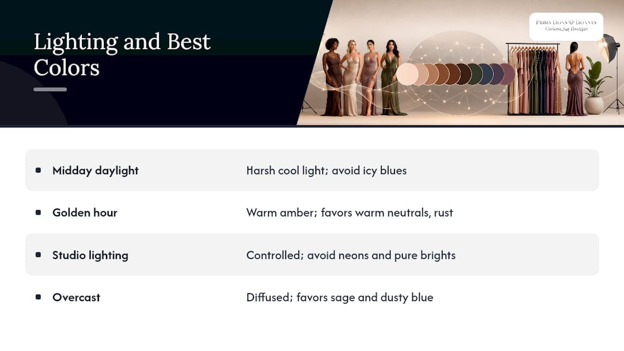
The same dress can look completely different depending on when and where you shoot it, because light doesn’t just illuminate color, it shifts it. Natural daylight around midday tends to be harsh and cool-toned, which can make already-cool colors like icy blue or grey look even more washed out. Golden hour, the hour or so before sunset, casts a warm amber glow that flatters warm neutrals like camel and rust but can mute cooler tones like navy or slate blue.
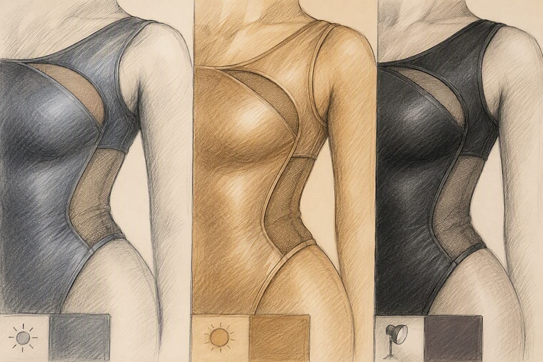
Studio lighting is the most predictable of the three, since photographers control color temperature directly, but it also has the least forgiveness for very saturated colors, which is part of why neons and pure brights cause exposure problems indoors as much as outdoors. Overcast days act almost like a giant natural diffuser, softening shadows and rendering colors closer to how they look in person, which makes cloudy days surprisingly reliable for accurate color representation.
If you’re shooting at golden hour, lean into warm neutrals and jewel tones that play well with amber light. For overcast or shaded settings, cooler mid-tones like sage and dusty blue tend to hold their integrity better than they would under harsh midday sun. When in doubt, ask your photographer what time and lighting setup they’ve planned, since that single detail changes which colors in your closet will actually perform.
Choosing Colors That Match Your Photoshoot’s Mood
A birthday shoot, a moody editorial session, and a soft engagement photo call for entirely different color stories, even if the same person is wearing the clothes. Color sets emotional tone before a single pose happens.
Playful, celebratory shoots, think birthdays or milestone events, tend to benefit from brighter but still camera-safe tones: a rich berry, a warm coral, or a deep teal add energy without tipping into the neon territory that causes technical problems. Romantic or soft-focus shoots, like engagement sessions, usually lean on blush, cream, sage, and dusty blue, tones that photograph gently and don’t compete with softer lighting setups. Moody, editorial-style shoots favor deeper, richer colors like charcoal, burgundy, and forest green, which hold drama without the exposure risk of pure black.
Matching your palette to the mood isn’t just an aesthetic nicety, it affects how cohesive the final gallery feels. A single bright accessory can nod to a playful theme even inside a mostly neutral outfit, while a monochrome charcoal-and-burgundy combination signals a more serious, editorial tone from the first frame. Decide on the emotional note you want before you choose the palette, then build backward from there.
A Quick Pre-Shoot Checklist From Latoya
The single most common color mistake isn’t picking a “wrong” color. It’s picking the right color in the wrong fit or fabric. Run through this before you leave the house:
- Confirm the fit sits right, nothing pulling or gaping.
- Do a 60-second undertone check if you haven’t already.
- Snap a test photo in similar lighting to your shoot.
- Cut any neon or highly saturated piece from the lineup.
- Match your palette across everyone in the frame.
- Choose accessories that support, not compete with, the main colors.
Tape this list inside your outfit bag. Future you will thank present you.
— Latoya
Prima Dons and Donnas: Photoshoot-Ready Colors, Made to Fit
Finding the precise shade a photographer recommends, in your size, can be difficult when relying on off-the-rack options. Made-to-order pieces can be designed to the color and fit needed rather than a retail store’s standard stock.
The made-to-order apparel collection covers dresses, tops, and outerwear built around your exact undertone-friendly palette, while custom plus-size apparel makes sure sizing never limits which colors are available to you. Running short on time before the shoot? Express shipping and the ready-to-ship collection both get camera-ready pieces to you fast, no custom-order wait required. For a deeper look at how personalization shapes the final look, Primadonsanddonnas’ guide to photoshoot attire personalization walks through the color-matching process in more detail.
Browse the made-to-order apparel collection and lock in your palette before your next session.
Sources
- What colors should you avoid in a photoshoot? — Duane Furlong Studios
- Understanding moiré in photography and how to avoid it — ProEdu
- What Color Is Most Flattering for Photos? (Professional Photographers Reveal the #1 Hue) — OutfitInsights
- What Colors Should You Wear for Your Headshot? — Headshots by Marie
FAQ
What Colors Look Best at a Photoshoot?
Muted mid-tones and neutrals like navy, cream, sage, and dusty rose consistently photograph well because they preserve detail and avoid color casts. Deep jewel tones like burgundy work too, especially for studio or evening sessions.
What Color Dress Should I Wear for a Photoshoot?
A dress in a muted mid-tone or warm neutral near your undertone family is the safest bet, with navy standing out as a particularly flattering, forgiving option across different lighting setups. If you can’t find the exact shade off the rack, a made-to-order option through the custom dress collection lets you match it precisely.
What Is the Best Color to Wear to a Professional Photoshoot?
There’s no single universal answer, since the best color depends on your undertone, the background, and the lighting, but navy is the most frequently recommended default for its balance of skin-tone rendering and texture retention. When possible, pair your color choice with a quick undertone check rather than guessing.
What Colors Should You Not Wear for a Photo Shoot?
Skip neon and highly saturated shades, pure white, pure black, and bright primary red unless your photographer confirms they’ll work for your specific setup and lighting. These tend to cause color casts, exposure clipping, or oversaturation that are hard to fix after the fact.


Leave a comment