The role of color in luxury fashion: bold personal hues
Many believe color in luxury fashion serves only as decoration, a superficial flourish to catch the eye. In reality, color operates as a strategic tool that shapes perceptions of quality, sustainability, and personal identity. The hues you choose communicate volumes about your values, confidence, and understanding of style. This article explores how color functions psychologically and practically in luxury fashion, empowering you to make informed choices that reflect your boldest self while honoring sustainable principles.
Table of Contents
- How Color Shapes Perceptions In Luxury Fashion
- Decoding Designer Strategies For Color In Seasonal Collections
- The Impact Of Color On Customer Experience And Personalization
- Applying Color Knowledge For Sustainable And Bold Luxury Style
- Explore Custom Luxury Fashion With Vibrant Color Choices
Key takeaways
| Point | Details |
|---|---|
| Emotional influence | Color triggers psychological responses that shape how others perceive luxury and quality in your wardrobe. |
| Brand strategy | Signature hues reinforce exclusivity and help luxury brands create instant recognition and emotional bonds. |
| Personal empowerment | Bold, personalized colors enable authentic self-expression and confidence in statement-making fashion. |
| Seasonal intelligence | Understanding color trends and cultural contexts enhances your ability to make timeless, sustainable style decisions. |
How color shapes perceptions in luxury fashion
Color psychology profoundly influences how shoppers experience and respond to luxury fashion. When you encounter a garment in deep emerald or vibrant crimson, your brain processes more than visual information. These hues trigger emotional associations that affect your perception of value, craftsmanship, and exclusivity. Research shows color psychology in retail influences shopper emotions and brand perception, making palette selection a critical strategic decision for luxury houses.
Luxury brands leverage specific colors to evoke feelings of sophistication and quality. Consider how Tiffany blue instantly signals refinement, or how Hermès orange communicates heritage and exclusivity. These signature hues function as visual shorthand, allowing customers to identify premium products at a glance. The strategic use of color extends beyond branding to influence purchasing decisions, with certain shades creating stronger emotional connections than others.
Color theory provides the foundation for understanding these effects. Warm tones like red and gold convey energy, passion, and opulence, while cool shades such as navy and silver suggest calm, trust, and timelessness. Luxury designers balance these associations with cultural meanings and seasonal appropriateness. A bold fuchsia might communicate confidence and modernity, while a muted taupe speaks to understated elegance and versatility.
“Color is not just decoration in luxury fashion. It’s a language that speaks to quality, values, and identity before a single word is exchanged.”
Understanding this language empowers you to curate a wardrobe that authentically represents your personality. When you grasp how different hues affect perception, you can choose colors that align with your personal brand and the messages you want to communicate. This knowledge becomes particularly valuable when exploring luxury fashion terminology, as it helps you decode designer intentions and make purchases that truly resonate with your style vision.
The distinction between luxury fashion and fast fashion becomes clearer when examining color quality and application. Luxury pieces feature carefully selected, often custom-dyed fabrics that maintain their vibrancy and depth over time. Fast fashion relies on trend-driven palettes that fade quickly, both literally and stylistically. Investing in well-considered colors ensures your wardrobe remains relevant and beautiful for years.
Key psychological effects of color in luxury fashion include:
- Red elevates heart rate and signals boldness, making it ideal for statement pieces
- Blue creates feelings of trust and stability, perfect for professional luxury wear
- Green connects to nature and sustainability, increasingly important in conscious fashion
- Purple historically represents royalty and continues to convey luxury and creativity
- Neutral tones offer versatility while allowing quality craftsmanship to shine
Decoding designer strategies for color in seasonal collections
Luxury designers approach seasonal color selection with meticulous planning, balancing trend forecasting with brand identity and customer expectations. The process begins months before collections debut, with design teams analyzing cultural movements, art exhibitions, and societal shifts. Designers meticulously plan color schemes each season to reflect sustainability and exclusivity, ensuring their palettes resonate emotionally while maintaining commercial viability.
Successful luxury collections strike a delicate balance between boldness and timelessness. A designer might introduce a striking coral or electric blue as a seasonal signature while grounding the collection in classic blacks, whites, and camels. This strategy allows fashion-forward customers to experiment with trend-driven hues while ensuring the collection appeals to those seeking enduring pieces. The result is a cohesive palette that feels fresh yet wearable beyond a single season.
Sustainability increasingly influences color choices in luxury fashion. Natural dyes derived from plants, minerals, and insects offer rich, complex hues while minimizing environmental impact. These sustainable alternatives often produce softer, more nuanced tones than synthetic dyes, contributing to the understated elegance associated with conscious luxury. Brands committed to ethical practices showcase these natural colors as badges of honor, proving that environmental responsibility enhances rather than limits aesthetic possibilities.
Seasonal color application follows a strategic framework:
- Identify core neutrals that anchor the collection and ensure versatility
- Select 2 to 3 bold accent colors that capture seasonal mood and trends
- Incorporate transitional shades that bridge core and accent palettes
- Test color combinations across different fabrics and lighting conditions
- Refine selections based on sustainability criteria and dye availability
- Create lookbooks demonstrating how colors work together in complete outfits
| Season | Typical Palette Strategy | Sustainability Focus |
|---|---|---|
| Spring | Pastels with vibrant accents | Plant-based dyes, organic cotton |
| Summer | Bright, saturated hues | Water-efficient dyeing, linen |
| Fall | Earth tones with jewel pops | Natural fiber blends, low-impact processes |
| Winter | Deep, rich colors | Recycled materials, responsible wool |
Pro Tip: Experiment with unexpected color accents to breathe new life into classic silhouettes. A timeless black blazer becomes a personal statement piece when you add a bold emerald lining or vibrant ruby buttons, demonstrating your understanding of both tradition and innovation.
The luxury fashion checklist essentials emphasize the importance of selecting colors that transcend fleeting trends. When building your wardrobe, prioritize hues that complement your skin tone, align with your lifestyle, and reflect your values. A well-chosen color palette ensures every piece works harmoniously, maximizing versatility while minimizing waste.
Designers also consider cultural color meanings when creating global collections. Red signifies luck and celebration in many Asian cultures, while white represents purity in Western contexts but mourning in others. Luxury brands navigate these nuances carefully, ensuring their color stories resonate across diverse markets without causing unintended offense or confusion.
The impact of color on customer experience and personalization
Color serves as a powerful vehicle for expressing individuality in luxury fashion. When you select a garment in your signature hue, you’re not just choosing an aesthetic preference but asserting your identity. Personalized color experiences enhance customer connection to luxury brands, transforming transactions into meaningful relationships. This emotional investment explains why custom color options have become essential in high-end fashion.
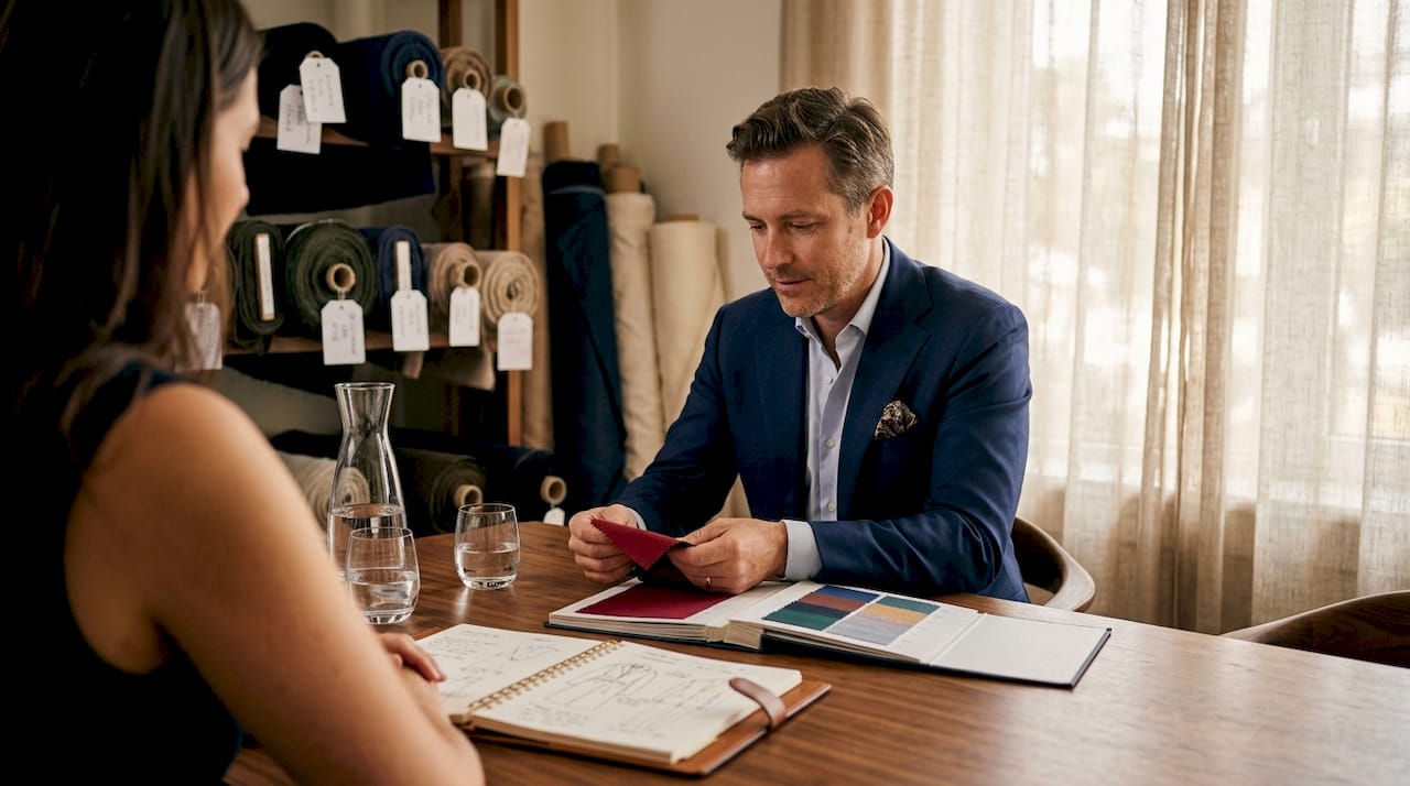
Luxury brands recognize that true exclusivity lies in personalization. Offering extensive color customization allows customers to co-create pieces that perfectly align with their vision. Whether you’re selecting a custom dress in a shade that matches your favorite artwork or choosing outerwear in a hue that complements your existing wardrobe, these decisions reflect your unique perspective. Made-to-order models excel at this approach, providing virtually limitless color possibilities.
The psychology of personal color selection reveals fascinating insights. You likely gravitate toward certain hues because they make you feel confident, powerful, or authentic. These preferences aren’t random but reflect your personality, experiences, and aspirations. Understanding why personalized fashion matters helps you recognize that color choices are deeply personal decisions deserving thoughtful consideration.
Customer-centric color personalization manifests in several ways:
- Virtual try-on tools allowing you to preview garments in multiple colorways
- Consultation services helping you identify flattering hues based on skin tone and style goals
- Seasonal color analysis integrating personal coloring with trend forecasts
- Custom dyeing services creating exact shade matches for special requests
- Mix and match options enabling unique color combinations across garment components
Pro Tip: Develop a signature color palette of 3 to 5 hues that consistently appear in your wardrobe. This strategy strengthens your personal brand, simplifies shopping decisions, and ensures new pieces integrate seamlessly with existing items. Your signature colors become part of your identity, making you instantly recognizable and memorably stylish.
Statement fashion relies heavily on bold color choices that command attention and communicate confidence. When you wear a striking color, you signal that you’re comfortable standing out and unafraid of visibility. This courage resonates with others, creating memorable impressions that extend far beyond the garment itself. Bold hues become conversation starters, networking tools, and expressions of creative courage.
The rise of made-to-order fashion has democratized access to personalized color options previously available only to ultra-wealthy clients commissioning bespoke pieces. Today’s technology enables brands to offer extensive customization at accessible price points, ensuring more women can experience the joy of wearing colors chosen specifically for them. This shift represents a fundamental change in luxury fashion, prioritizing individual expression over mass-market uniformity.
Color personalization also supports sustainability by reducing returns and increasing garment longevity. When you participate in selecting your piece’s exact shade, you’re more likely to love and wear it repeatedly. This emotional investment translates to practical benefits, as cherished items remain in rotation longer, reducing the need for constant replacement and minimizing fashion waste.
Applying color knowledge for sustainable and bold luxury style
Choosing between bold and muted palettes involves weighing aesthetic preferences against sustainability considerations. Bold colors often require more intensive dyeing processes, potentially increasing environmental impact. However, advances in natural and low-impact dyes now enable vibrant hues with minimal ecological footprint. Muted tones traditionally associated with sustainability offer timeless elegance but may not satisfy your desire for expressive, attention-grabbing style.
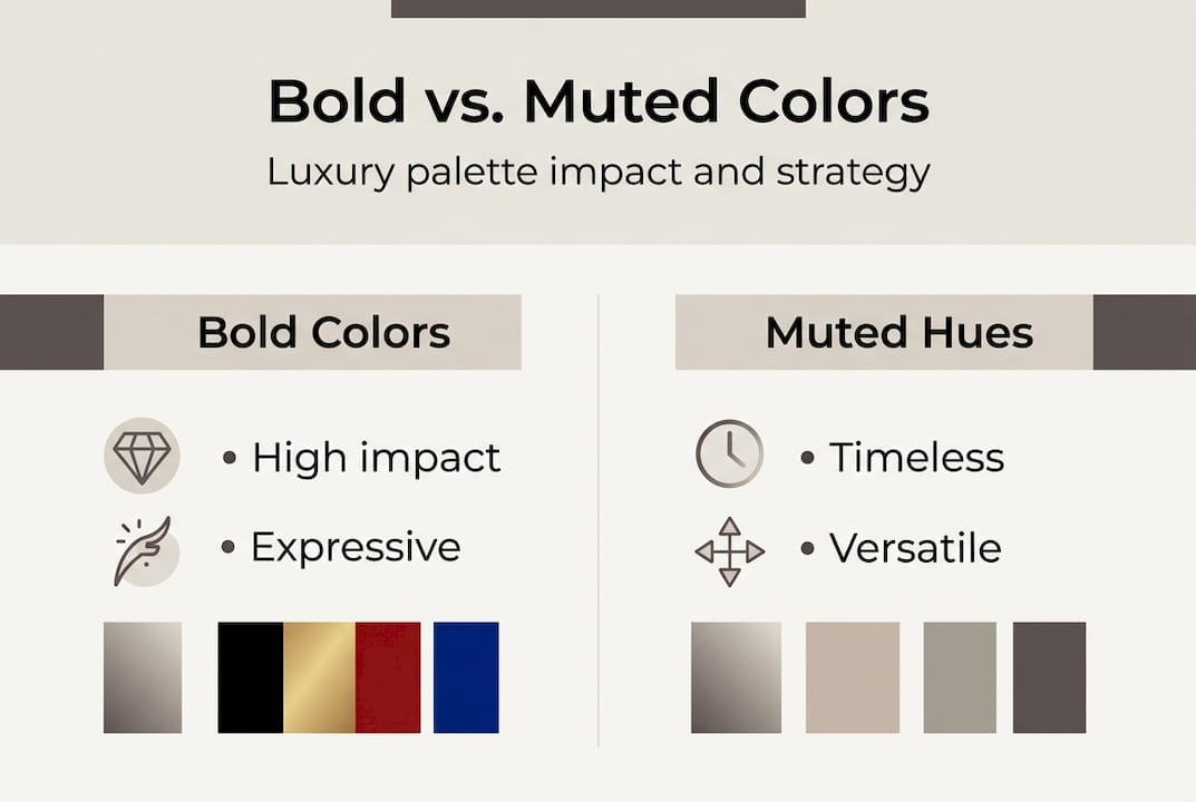
The key lies in informed decision-making rather than absolute rules. Sustainable luxury embraces color choices that minimize environmental impact without compromising style. You can wear bold, saturated hues responsibly by selecting pieces made with plant-based dyes, supporting brands with transparent supply chains, and investing in quality garments designed for longevity. Sustainability and visual impact are not mutually exclusive when approached thoughtfully.
| Palette Type | Visual Impact | Sustainability Considerations | Best Applications |
|---|---|---|---|
| Bold primaries | Maximum attention, energetic | Requires careful dye selection | Statement pieces, special occasions |
| Jewel tones | Rich, luxurious, confident | Often achievable with natural dyes | Versatile wardrobe staples |
| Earth tones | Grounded, sophisticated, calm | Easily produced sustainably | Professional wear, layering pieces |
| Pastels | Soft, feminine, approachable | May require bleaching processes | Spring/summer collections |
| Neutrals | Timeless, versatile, elegant | Minimal processing needed | Foundation pieces, year-round wear |
Mixing colors to create unique luxury looks requires understanding complementary relationships and proportions. Start with a neutral base, then introduce one or two accent colors in smaller doses. This approach allows bold hues to shine without overwhelming your silhouette. Alternatively, embrace monochromatic dressing in varying shades of a single color for sophisticated, cohesive looks that feel intentional and polished.
Evaluating color choices for sustainability and style involves several key criteria:
- Dye source and production method
- Color fastness and longevity
- Versatility and coordination with existing wardrobe
- Personal resonance and confidence boost
- Cultural appropriateness and context
- Seasonal relevance and wearability timeline
Embracing bold hues responsibly means rejecting fast fashion’s disposable approach to trend colors. Instead of purchasing cheap garments in this season’s hot shade, invest in quality pieces in colors you genuinely love. Explore trends in custom fashion 2026 to understand how personalization enables bold color choices without contributing to waste cycles. Custom pieces in your preferred hues eliminate the compromise between trend participation and sustainable consumption.
The spring 2026 plus size fashion trends demonstrate how inclusive sizing and bold color options intersect to empower diverse bodies. When luxury fashion offers extensive color customization across all sizes, it affirms that every woman deserves access to hues that make her feel confident and beautiful. This inclusive approach to color represents the future of sustainable, personalized luxury.
Practical strategies for bold, sustainable color usage include starting with accessories in experimental shades, layering colorful pieces with neutral foundations, and choosing reversible or convertible garments offering multiple color options. These approaches allow you to explore vibrant palettes while maintaining wardrobe versatility and maximizing each piece’s utility.
Explore custom luxury fashion with vibrant color choices
Now that you understand color’s strategic role in luxury fashion, it’s time to apply this knowledge to your own wardrobe. Prima Dons and Donnas specializes in made-to-order pieces that celebrate bold, personalized color choices tailored to your exact specifications. Every garment is crafted with your unique vision in mind, ensuring you receive pieces that authentically represent your style and values.
Our custom made-to-order dress collection showcases the possibilities when you control every color decision. From vibrant jewel tones to sophisticated neutrals, you select the exact shades that make you feel confident and beautiful. Each dress is constructed with meticulous attention to detail, ensuring your chosen colors are rendered in rich, lasting hues that maintain their vibrancy wear after wear. Explore custom outerwear options that allow you to express your personality through color while enjoying superior craftsmanship and sustainable materials. Our custom and made-to-order apparel empowers you to build a wardrobe that reflects your boldest, most authentic self.
FAQ
What does the color red symbolize in luxury fashion?
Red represents passion, power, and confidence in luxury fashion contexts. It commands attention and signals that the wearer is bold, unafraid of visibility, and comfortable making strong statements. Luxury brands use red strategically for pieces designed to empower and energize.
How can I choose sustainable colors for my luxury wardrobe?
Prioritize colors produced with natural or low-impact dyes, and select timeless hues that remain stylish beyond seasonal trends. Research brands’ sustainability practices and opt for pieces in shades you’ll wear repeatedly, maximizing each garment’s lifespan and reducing overall consumption.
Why do luxury brands use signature colors?
Signature colors reinforce brand identity and create instant recognition in crowded markets. They establish emotional connections with customers, who associate specific hues with quality, heritage, and exclusivity. This color consistency builds brand equity and differentiates luxury houses from competitors.
Can bold colors work in professional luxury settings?
Absolutely. Bold colors in professional contexts communicate confidence, creativity, and leadership when styled appropriately. Choose rich jewel tones or sophisticated brights in tailored silhouettes, and balance statement colors with neutral accessories to maintain polish while expressing personality.
How do I find my most flattering luxury fashion colors?
Consider professional color analysis based on your skin’s undertones, or experiment systematically with different hues near your face to observe which create a healthy, radiant appearance. Pay attention to colors that generate compliments and make you feel energized, as these likely complement your natural coloring beautifully.


Leave a comment