Master the role of color choice in fashion for bold style
Most people think color choice in fashion is purely personal, a matter of taste or mood. But science reveals something different: color theory principles govern how hues interact, creating harmony or drama in your wardrobe. Cultural meanings and low saturation colors signal luxury, influencing how others perceive your style. Sustainable natural dyes offer eco-friendly alternatives with unique character, though they come with trade-offs. This guide shows you how to combine color theory, cultural awareness, and sustainable choices to craft bold, personalized fashion statements that reflect confidence and conscious values.
Table of Contents
- Key takeaways
- Understanding color theory basics in fashion choices
- Cultural and status influences of color choices in fashion
- Sustainable natural dyes: eco-friendly color choices with character
- Personalizing bold style with seasonal palettes and sustainable colors
- Explore custom sustainable fashion for your bold color choices
- Frequently asked questions
Key Takeaways
| Point | Details |
|---|---|
| Color theory basics | Hue, saturation, and value determine how colors interact to create mood and visual impact. |
| Low saturation signals luxury | Low saturation tones are perceived as more refined and premium in fashion contexts. |
| Sustainable dyes tradeoffs | Sustainable natural dyes offer unique character but may limit color range and longevity. |
| Palette pairing with eco dyes | Pair seasonal palettes with eco friendly dyes to personalize bold looks while keeping sustainability in mind. |
Understanding color theory basics in fashion choices
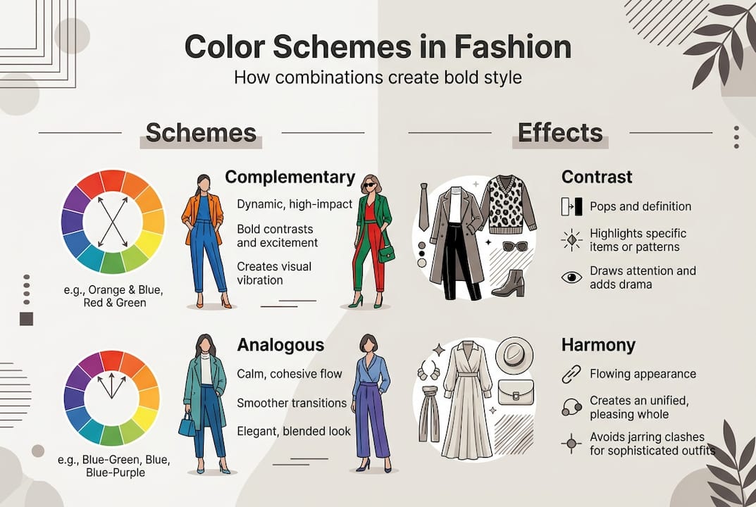
Color theory principles provide the foundation for every successful outfit. Hue refers to the pure color itself, like red or blue. Saturation measures intensity, from vivid to muted. Value describes lightness or darkness. These three elements determine how colors interact on your body, creating visual impact or subtle elegance.
Color wheels organize hues to reveal relationships. Complementary schemes pair opposites like orange and blue, generating high contrast and energy. Analogous schemes use neighbors like yellow, yellow-green, and green for harmonious, flowing looks. Triadic schemes select three evenly spaced hues, such as red, yellow, and blue, for balanced yet dynamic statements. Each scheme offers different emotional tones and style expressions.
Harmony happens when colors feel balanced and pleasing together. Contrast creates drama and draws attention to specific pieces or body areas. A monochromatic outfit in varying shades of burgundy feels cohesive and sophisticated. A bright yellow jacket over charcoal pants commands attention through stark contrast. Understanding these dynamics lets you control the message your wardrobe sends.
Pro Tip: Prioritize value contrast over hue alone for maximum visual impact. A light lavender top with dark navy pants creates stronger definition than two medium-toned colors, even if they’re complementary hues.
Key color theory elements for fashion:
- Hue: The pure color name (red, blue, green)
- Saturation: Intensity from vivid to muted or grayed
- Value: Lightness or darkness of a color
- Complementary: Opposite colors creating high contrast
- Analogous: Neighboring colors for harmony
- Triadic: Three evenly spaced colors for balance
| Color Scheme | Example Combination | Fashion Effect |
|---|---|---|
| Complementary | Orange and teal | Bold, energetic, attention-grabbing |
| Analogous | Blue, blue-green, green | Harmonious, flowing, calming |
| Triadic | Red, yellow, blue | Balanced, dynamic, playful |
| Monochromatic | Light to dark burgundy | Sophisticated, cohesive, elegant |
Color theory in fashion extends beyond simple matching. It shapes mood, draws the eye, and communicates personality before you speak. Mastering these basics gives you the tools to build outfits that feel intentional and powerful, whether you’re aiming for subtle elegance or head-turning boldness.
Cultural and status influences of color choices in fashion
Color carries meaning beyond aesthetics. Research shows low saturation colors signal luxury, with muted tones like dusty rose or sage green perceived as more exclusive than bright counterparts. Consumers associate subtlety with premium quality, making desaturated palettes a shortcut to conveying sophistication and status. This isn’t arbitrary; it’s rooted in how we process visual information and cultural conditioning around restraint and refinement.
Cultural contexts shift color meanings dramatically. White symbolizes purity and weddings in Western cultures but represents mourning in many Asian traditions. Purple historically signified royalty in Europe due to expensive dye costs, while it can denote mourning in Brazil. Red signals luck and celebration in China but danger or passion in Western contexts. Understanding these associations helps you craft bold fashion statements that resonate with your intended audience or personal heritage.
“Low saturation colors often signal higher luxury brand status, while color preferences vary culturally, including purple’s significance across different societies.”
Using culturally aware colors deepens your style narrative. If you’re celebrating heritage or communicating with a specific community, choosing colors with positive cultural associations adds layers of meaning to your outfit. A deep indigo dress might honor Japanese textile traditions, while vibrant marigold yellow could celebrate Indian festivals. These choices transform fashion from decoration into storytelling.
Cultural color associations to consider:
- White: Purity (Western) vs. mourning (Asian)
- Red: Luck (Chinese) vs. passion (Western)
- Purple: Royalty (European) vs. mourning (Brazilian)
- Yellow: Joy (global) vs. caution (traffic contexts)
- Black: Elegance (fashion) vs. mourning (many cultures)
Saturation levels also affect emotional response. Highly saturated colors feel youthful, energetic, and attention-seeking. Desaturated tones feel mature, calm, and sophisticated. This explains why luxury brands favor muted palettes while youth-focused fast fashion embraces neon brights. Your color saturation choices signal where you position yourself on the spectrum from playful to refined, accessible to exclusive.
These cultural and psychological dimensions of color empower you to make strategic choices. Rather than picking colors randomly, you can select hues and saturation levels that align with your personal brand, cultural identity, and the status signals you want to project. This awareness transforms color from a superficial decision into a powerful tool for custom fashion expression.
Sustainable natural dyes: eco-friendly color choices with character
Natural dyes offer eco-benefits like lower water consumption and biodegradability, but they come with trade-offs. Synthetic dyes provide consistent, vibrant colors with excellent fastness, meaning they resist fading through washing and sun exposure. Natural dyes produce softer, more variable hues that may fade faster and shift between batches. This inconsistency frustrates some but delights others who value the artisanal uniqueness of each piece.
Common plant-based dyes include madder root for reds and pinks, indigo for blues, weld for yellows, and logwood for purples and blacks. Each requires specific preparation and mordants, which are mineral salts that help dye bind to fabric. Alum is the most common and least toxic mordant, while iron creates darker shades but can weaken fibers over time. Some traditional mordants like chrome pose environmental concerns, creating a paradox where natural dyes require potentially harmful processing aids.
| Dye Type | Color Range | Fastness | Eco-Impact | Cost |
|---|---|---|---|---|
| Synthetic | Full spectrum, vivid | Excellent | High water use, chemical runoff | Low |
| Natural | Earth tones, softer hues | Moderate | Lower water, biodegradable | High |
| Low-impact synthetic | Full spectrum | Excellent | Reduced chemicals, better wastewater | Medium |
Color fastness challenges mean naturally dyed garments need gentler care. Sunlight breaks down natural pigments faster than synthetic ones, so avoid prolonged direct exposure. Hot water accelerates fading, making cold washes essential. Harsh detergents strip natural dyes more aggressively than synthetics. These limitations require commitment but reward you with colors that age gracefully, developing patina rather than looking worn.

Pro Tip: Embrace batch variation as artisanal uniqueness in custom wardrobes. Two indigo pieces from different dye lots won’t match perfectly, but this creates visual interest and ensures no one else owns exactly your combination.
Caring for naturally dyed garments:
- Wash in cold water with pH-neutral detergent to preserve color intensity
- Air dry away from direct sunlight to prevent UV fading
- Store in dark, cool spaces to minimize light exposure
- Refresh faded colors with periodic re-dyeing or overdyeing for new looks
- Accept gradual color evolution as part of the garment’s story
The higher cost of natural dyes reflects labor-intensive processing and lower yields compared to synthetic alternatives. A single naturally dyed garment might cost 30 to 50 percent more than a synthetic equivalent. But for sustainable fashion enthusiasts, this premium buys reduced environmental impact, support for traditional craft skills, and one-of-a-kind color character that synthetic dyes can’t replicate.
Natural dyes align with slow fashion values, encouraging you to buy fewer, higher-quality pieces that you’ll cherish longer. The color variations and gentle fading become part of each garment’s narrative, marking time and wear in ways that feel organic rather than damaged. This shifts your relationship with clothing from disposable commodity to valued companion.
Personalizing bold style with seasonal palettes and sustainable colors
Seasonal color analysis categorizes individuals into spring, summer, autumn, or winter based on skin undertone, hair color, and eye color. Each season has a palette of flattering hues that enhance natural features and create harmonious, confident looks. Spring types glow in warm, bright colors like coral and golden yellow. Summer types shine in cool, soft hues like lavender and dusty blue. Autumn types radiate in warm, muted tones like rust and olive. Winter types command attention in cool, vivid shades like emerald and true red.
Seasonal palette traits for bold statements:
- Spring: Warm, clear, bright (peach, bright coral, golden yellow, turquoise)
- Summer: Cool, soft, muted (rose pink, periwinkle, lavender, soft teal)
- Autumn: Warm, muted, rich (terracotta, olive, burnt orange, chocolate brown)
- Winter: Cool, clear, vivid (true red, royal blue, emerald green, black)
Combining seasonal palettes with natural dyes creates eco-friendly bold expression. An autumn type might choose madder-dyed rust or logwood-dyed plum, both naturally derived and perfectly aligned with their warm, rich coloring. A winter type could select indigo-dyed deep blue or iron-mordanted black, achieving dramatic contrast while supporting sustainable practices. This marriage of personal color science and environmental consciousness produces wardrobes that feel both flattering and values-aligned.
Balancing bold colors with neutrals enhances versatility and impact. A capsule wardrobe built on neutral foundations like cream, taupe, charcoal, and navy allows bold statement pieces to shine without overwhelming. One vibrant emerald blazer transforms multiple neutral base outfits, maximizing wear per garment and reducing overconsumption. This approach supports sustainability by extending wardrobe longevity while ensuring you always have outfit options that feel fresh and intentional.
Neutrals in naturally dyed fabrics offer subtle sophistication. Undyed organic cotton, linen, or wool in their natural off-white, beige, or gray tones provide eco-friendly bases. Overdyeing these with soft natural colors like tea-stained brown or onion skin gold adds warmth without sacrificing versatility. These earth-toned neutrals pair beautifully with bolder naturally dyed accent pieces, creating cohesive looks rooted in sustainable practices.
Pro Tip: Test seasonal palette recommendations with fabric swatches in natural light before committing to custom pieces. What looks flattering in a color analysis chart might shift when translated to specific natural dye results.
Personalizing bold style means understanding which colors make you feel powerful and look vibrant, then sourcing those hues through sustainable means when possible. If your seasonal palette includes colors difficult to achieve with natural dyes, consider low-impact synthetic alternatives for those specific shades while choosing natural dyes for earth tones and neutrals. This pragmatic approach balances fashion personalization with environmental responsibility.
Seasonal analysis also guides you away from unflattering colors that drain your complexion or clash with your natural coloring. A spring type in heavy charcoal gray might look washed out, while a winter type in warm peach could appear sallow. Avoiding these mismatches saves money and closet space by preventing purchases you’ll never wear. Combined with sustainable dye choices, seasonal awareness creates a focused, flattering, eco-conscious wardrobe that expresses bold confidence through custom fashion trends aligned with your unique coloring.
Explore custom sustainable fashion for your bold color choices
Understanding color theory, cultural meanings, and sustainable dyes empowers you to make intentional fashion choices. Prima Dons and Donnas translates these insights into reality through custom, made-to-order pieces that put you in control of every color decision. Whether you want a specific seasonal palette shade or a naturally dyed earth tone, custom creation ensures your wardrobe reflects your values and flatters your unique coloring.
The brand’s commitment to personalization means you’re not limited to mass-produced color options that might not suit your seasonal palette or bold style vision. Custom pieces let you specify exact hues, choose sustainable fabric options, and ensure perfect fit alongside color harmony. This level of control transforms fashion from compromise to pure self-expression, supporting both environmental consciousness and confident personal style.
Pro Tip: Choosing custom pieces lets you control colors, fabric sustainability, and fit simultaneously, creating garments that check every box for values-aligned bold fashion.
Explore these custom collections:
- Made-to-order dress collection for statement pieces in your perfect colors
- Custom outerwear collection for bold seasonal palette coats and jackets
- Custom made-to-order apparel for complete wardrobe personalization
Made-to-order production reduces waste by creating only what’s purchased, eliminating the overproduction and unsold inventory that plague fast fashion. This sustainable business model aligns with conscious consumption values while delivering the color precision and fit perfection that ready-to-wear rarely achieves. Your bold color choices become reality without contributing to fashion industry waste.
Frequently asked questions
How does color saturation affect fashion status?
Low saturation colors signal luxury because consumers associate muted, sophisticated tones with premium brands and exclusivity. Highly saturated bright colors feel more accessible and youthful, while desaturated versions of the same hues convey restraint and refinement. This perception influences how others judge your style and status based on color intensity choices.
What are the challenges of using natural dyes in fashion?
Natural dyes face challenges including batch color variation, lower fastness compared to synthetics, and dependence on mordants that may be toxic. Colors fade faster with washing and sun exposure, requiring gentler care. Some traditional mordants like chrome pose environmental concerns, creating trade-offs between natural pigments and processing chemicals. These limitations demand commitment but reward with unique, artisanal color character.
How can I use seasonal color analysis to choose fashion colors?
Seasonal analysis enables personalized palettes by identifying whether you’re spring, summer, autumn, or winter based on skin undertone, hair, and eye color. Choose colors from your season’s palette to enhance natural features and create flattering, confident looks. Pair this knowledge with sustainable dye options to build an eco-friendly wardrobe that makes you look and feel powerful while expressing bold, individualized style.
Why balance bold colors with neutrals in a sustainable wardrobe?
Balancing bold and neutral colors enhances versatility and visual impact by creating a foundation that makes statement pieces shine. Neutrals like cream, taupe, and charcoal pair with multiple bold accents, maximizing outfit combinations per garment and reducing overconsumption. This approach extends wardrobe longevity and supports sustainability while ensuring you always have fresh, intentional looks that express confidence without overwhelming your natural coloring or style narrative.
Recommended
- Bold Style Fashion: How It Empowers Women Worldwide – Prima Dons & Donnas
- Why Bold Fashion Empowers Today’s Women – Prima Dons & Donnas
- How to Style Custom Clothing for Unique, Confident Looks – Prima Dons & Donnas
- 6 Types of Statement Outfits for Confident, Bold Women – Prima Dons & Donnas
- Colour Psychology and The Use of Colour – OnlyRoses - UK


Leave a comment